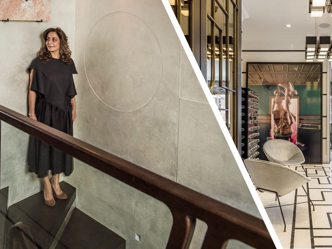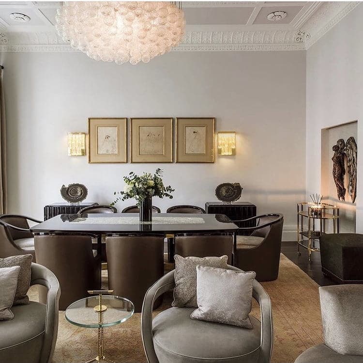
When you want to transform a room or give your home a new, fresh feel, the Pantone Colour of the Year is always a good place to start. In 2021, world-renowned colour institute, Pantone have defied convention to name two shades as their Colour of the Year: Illuminating and Ultimate Gray.
Identifiable as Pantone shades 13-0647 and 17-5104 respectively, zingy, Illuminating and the natural, reliable hues of Ultimate Gray provide the perfect base of your design choices in 2021. If you’re eager to incorporate these outstanding Colours of the Year into your home, take a look at these top tips now:
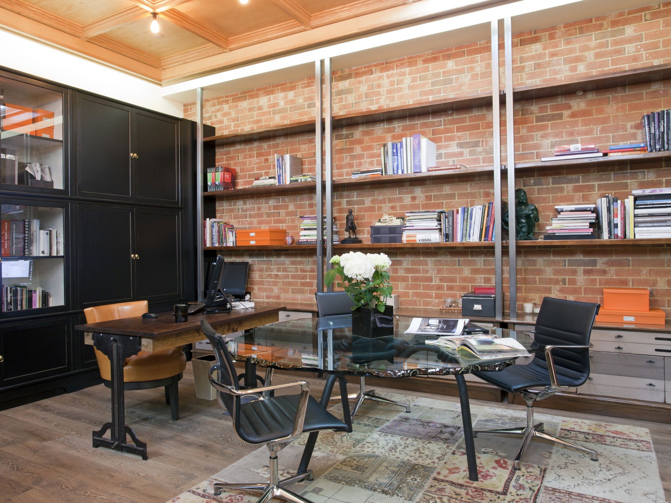
1. Home Office
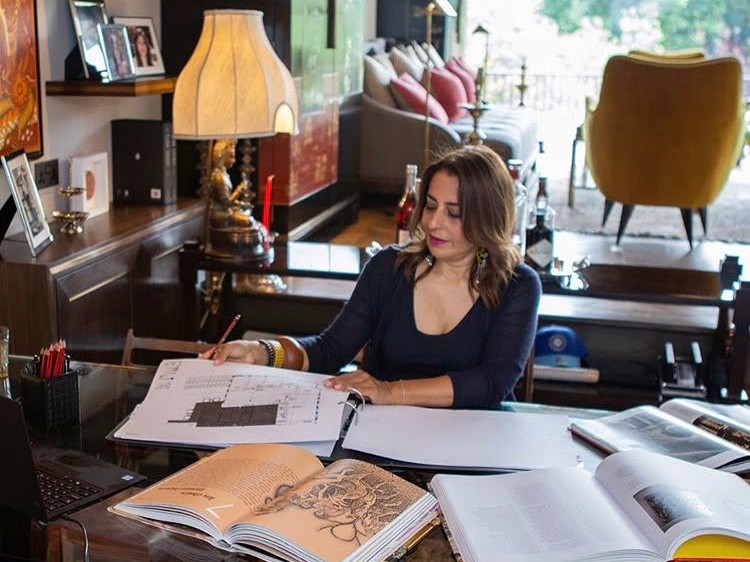
Remote working has taken off in a big way over the last few months and it’s a trend that’s set to continue for the foreseeable future. In response, millions of people are creating bespoke home offices, which means the release of Pantone’s Colours of the Year comes at the perfect time.
If you’re looking for a motivating shade that will boost your productivity and optimism, look no further than Illuminating, a lovely warm egg-yolk yellow. When combined with the dependable elements of Ultimate Gray, it creates the perfect backdrop for any home office or study area.
2. Kitchen
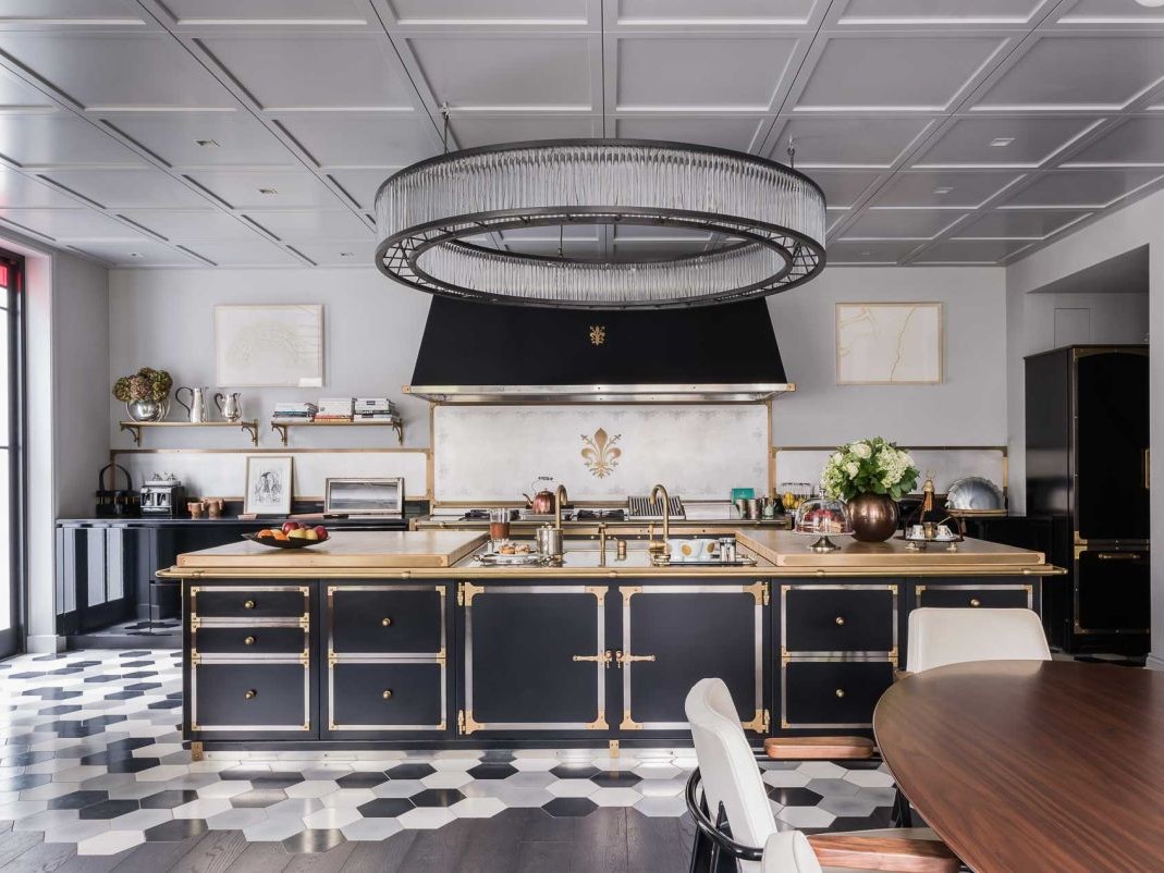
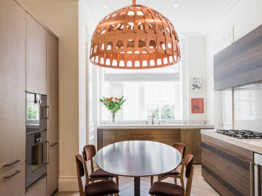
Traditionally, homeowners have favoured bright colours in kitchens because they add light and vibrancy to typically small areas. However, the trend towards open-plan kitchen-diners and larger kitchens has encouraged people to think outside the box when it comes to kitchen design.
Fortunately, Pantone’s Colours of the Year work perfectly together to meld these two design themes. Ultimate Gray is the ideal shade to give walls, cupboards, and islands an enviable solid, matt finish, while the bold hue Illuminating adds a little sunshine.
3. Furnishings and Fabrics
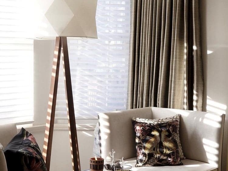
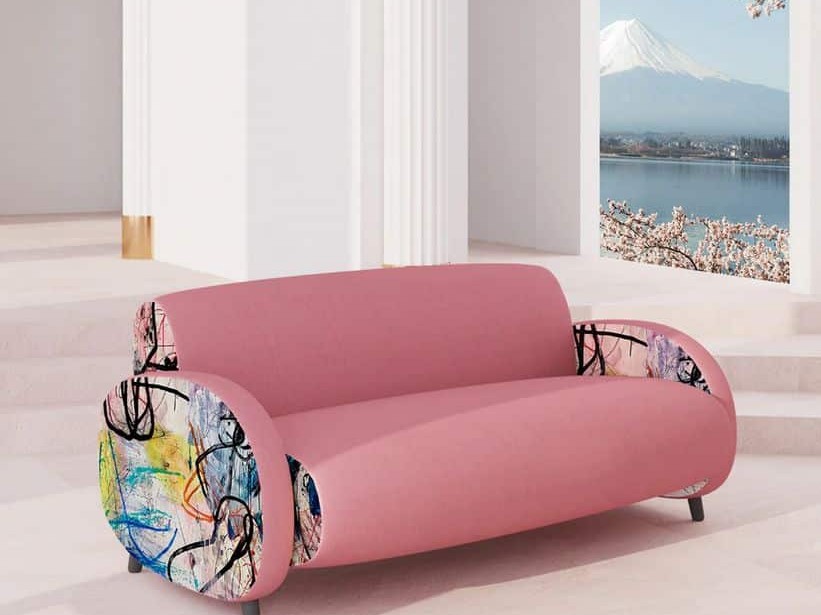
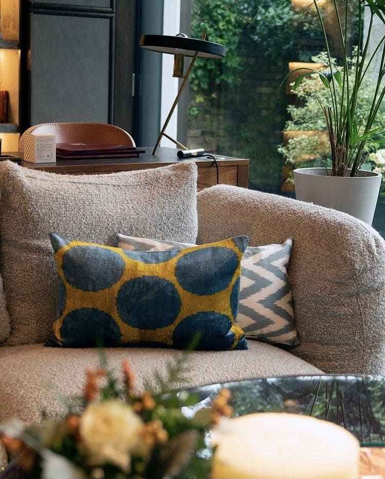
With the right furnishings and fabrics, you can incorporate Pantone’s Colours of the Year into any – or every – room in your home. A chic sofa in subtle grey is a great addition to any living space while accompanying throws and cushions in Illuminating yellow will lift the shade and add a pop of colour to the space.
Similarly, you’ll see a wide range of wallpapers that incorporate both greys and yellows this year, so why not make the most of them? Bolder prints make the perfect statement wall, while more subtle hues can work well throughout the room.
4. Bedroom
Your bedroom should be a zone of relaxation and tranquillity, but it also needs to uplift and motivate you every morning. To achieve these seemingly contrasting goals, use Ultimate Gray and Illuminating yellow to create a relaxing and reassuring haven that brightens your mood and boosts your energy. The reliability and dependability of Ultimate Gray is exactly what we need in these unusual times, while the power and energy of Illuminating yellow revitalises and re-energises.
Embrace Ultimate Gray and Illuminating Yellow Today
No matter how you choose to incorporate Pantone’s Colours of the Year into your home, you’ll be glad you did. Selected to represent clarity, energy, and hope, they’re the perfect shades to embody your home in 2021.
Related articles
Open Concept Kitchen: Creating a Seamless Flow between Cooking and Living Spaces
Maximising your social and cooking space in an open-concept kitchen
Modern Ceiling Design Ideas For Interior Design
We shine a light on an often overlooked part of a room, from murals to metallics.
What To Expect From Your First Interior Design Meeting
From concept sketches to vision boards, everything you need to prepare for your initial meeting.


