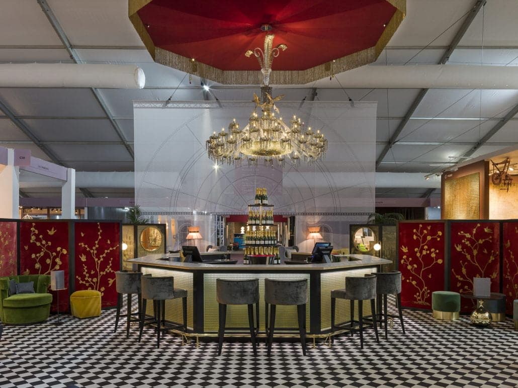
Just like the Silk Route once connected powerful fabric merchants between Asia, Middle East and Europe, today the PAD is a place where the paths of 20th century design dealers, collectors and interior designers intersect.
For the 12th time a monumental white pavilion reappeared on Berkeley Square to gather 68 exhibitors specializing in modern and vintage furniture, art, ceramics, lighting and jewelry. With a noticeable shift towards 20th century decorative arts, this year’s fair was a real treat for Shalini Misra’s team to attend. We have rounded up for you some of the most striking themes.
1. Galactic Odyssey
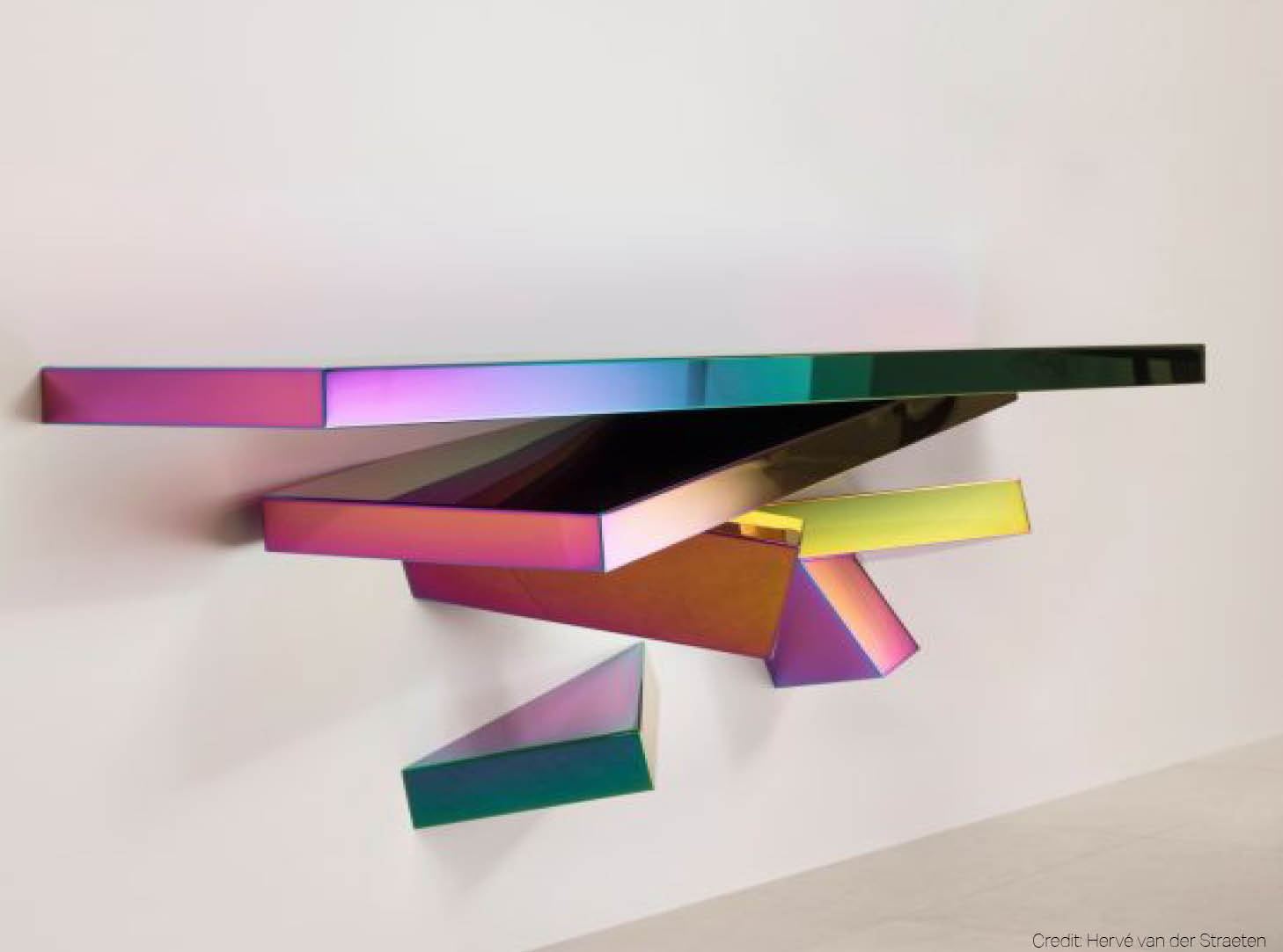
Known for his penchant for sculptural furnishings and jewelry as well as multiple fashion collaborations with Dior or Guerlain, Hervé van der Straeten introduced himself to the audience as a fearless spatial explorer at this year’s PAD. His iridescent console ‘Borderline’, piercing across the wall with its sharp geometric pieces, made us wonder what might be hiding on the other side of this spatial collision.
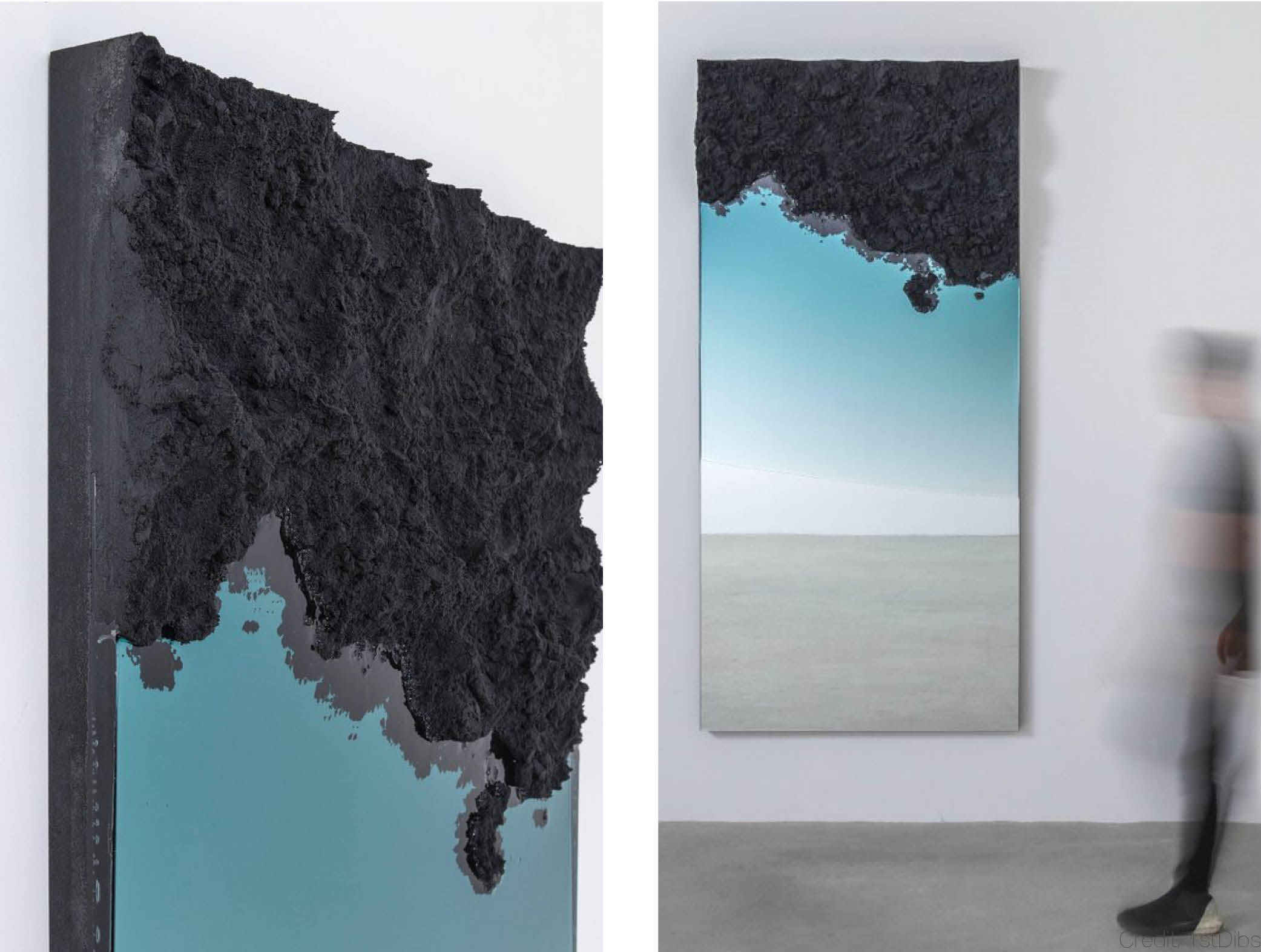
Resting somewhere between meteorite debris and volcanic lava, the surface of Fernando Mastrangelo’s mirror ‘Flood’ is certainly something to examine with a true explorer’s caution. Its vast reflexive surfaces invite us to take a spacewalk with the tips of our fingers along its unpenetrated edges. That is what Rossana Orlandi, the avant-garde-minded Milanese curator, would most likely expect from the modern collectors: to turn from passive observers to active explorers.
2. Voluptuous Curves
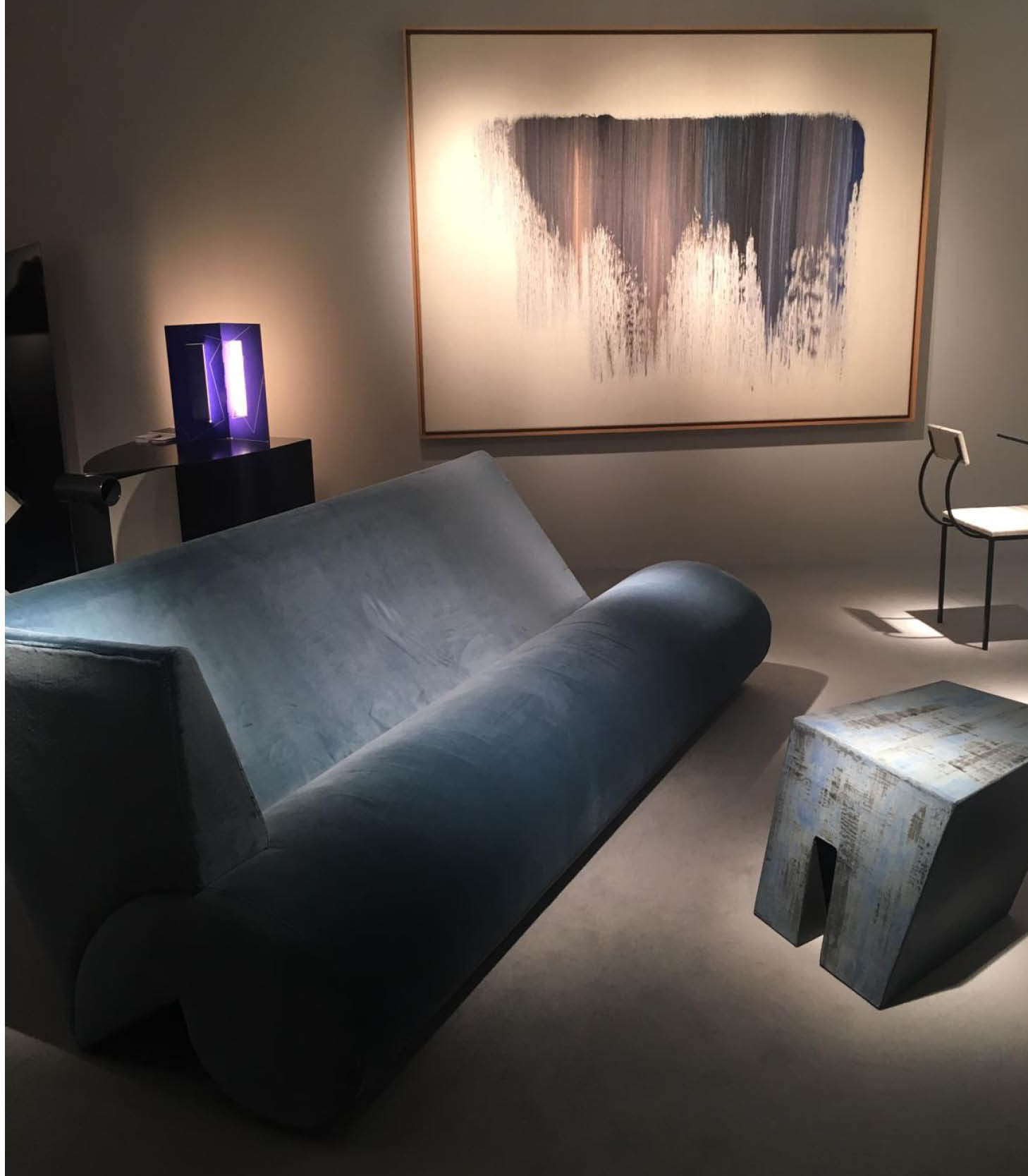
Avant-garde sensuality is what people dream about. Nothing seem to echo this sentiment better than voluptuously curvaceous sofas that speak with audacity and gentleness all at once. At Galerie Alexandre Guillemain you can now embrace their soft sculptural qualities.
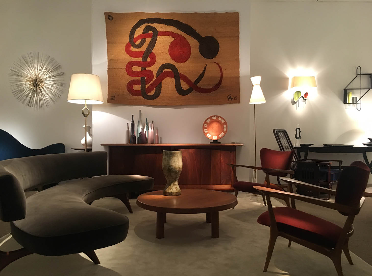
For those craving liberation from a rectangular arrangement of two straight sofas mirroring each other, Vladimir Kagan’s floating wonder is a perfect solution. This 1952 avant-garde design not only helps to break up the hard lines of modern interiors but also creates a sense of enclosure that connects people within an intimate circle.
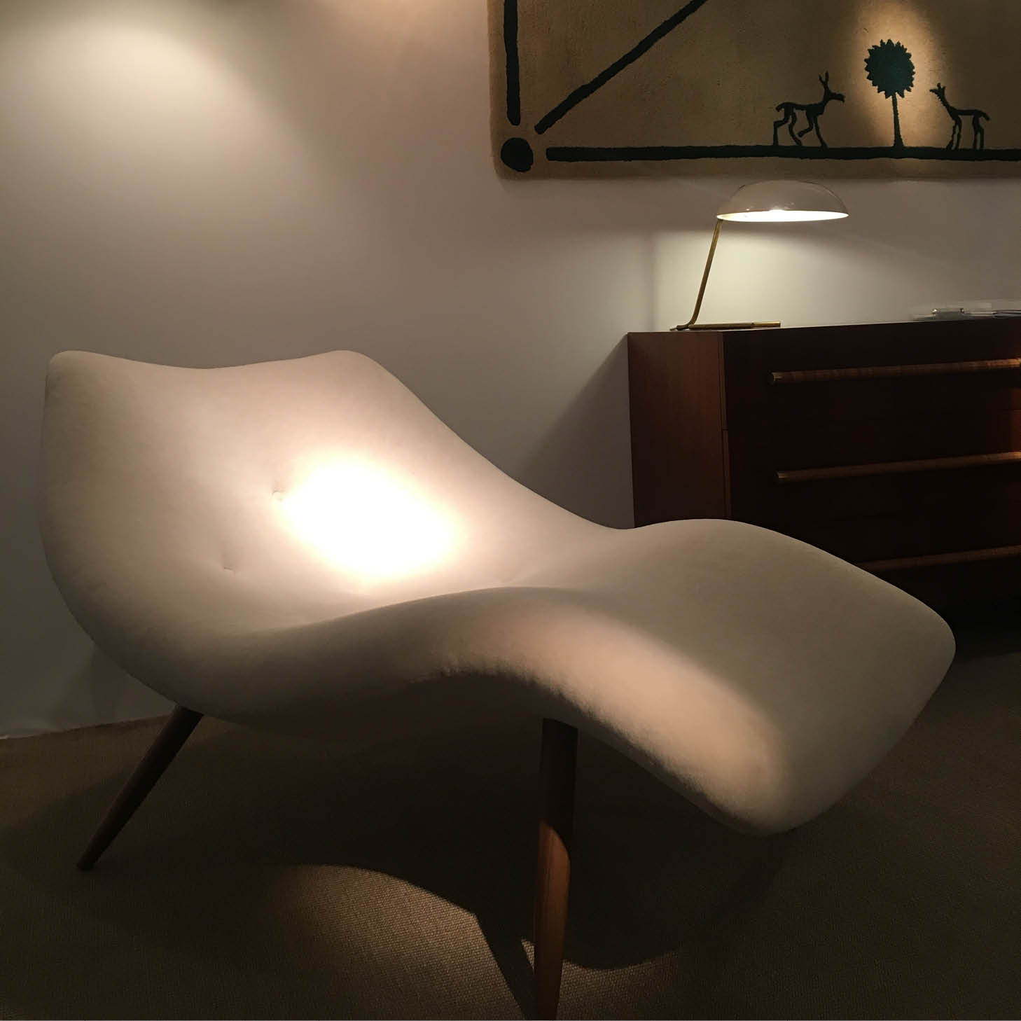
Curves have another quality: they seem to float in a space enveloping and lifting everything and everyone around them. Adrian Pearsall used white velvet and American walnut to create an impression of a billowing cloud that swells into a form of a lounge chair.
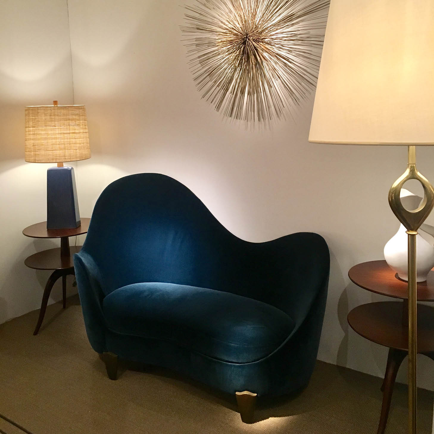
Silhouettes of curvy designs have one more clear advantage – they echo the physiognomy of human body. Garouste & Bonetti’s ‘Koala’ sofa is both ergonomically sculptural and elegantly cocooning. The soft, yielding velvet demands to be set free from any potential angular frameworks that may hinder its free-flowing motion. Swelling like sails in the wind, this 1995 French design injects a sense of movement not only in our interiors but also in our veins.
3. Mounting Murals
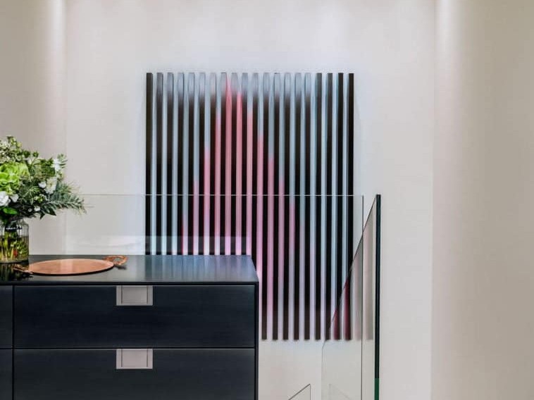
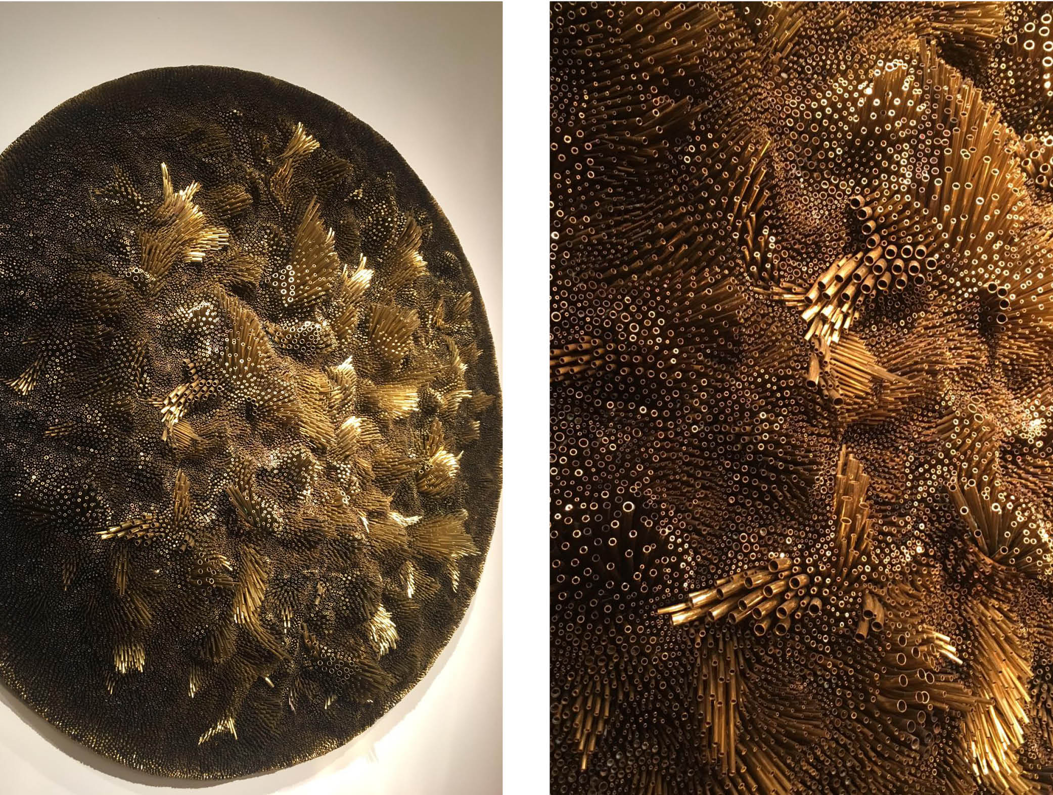
They weren’t afraid to take the risk. Valerio Capo and Sam Pratt, co-founders of London’s Gallery Fumi, went ahead with their unusual venture in the midst of 2008 economic deflation and proved that with a powerful idea, passion, impeccable craftsmanship and young talent anything is possible. 10 years later mural designs by one of their curated artists were at the very heart of the PAD’s fervent discussions. Rowan Mersh’s ‘Fluens Aeris’ was truly hypnotic, to say the least. Created with rolled brass tubes of various calibers and lengths, this piece gave Mersh a chance to experiment with fluid movements set within hard construction.
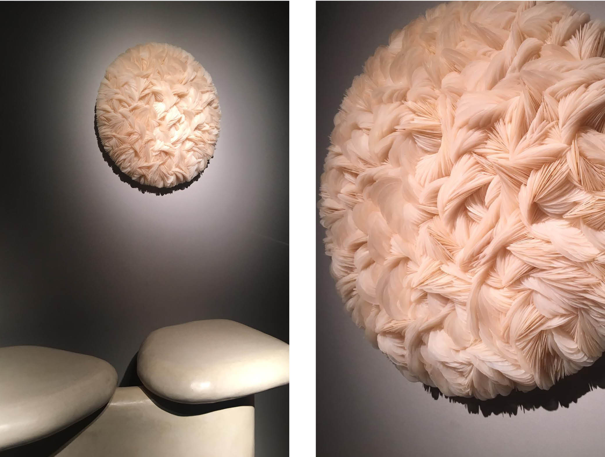
Even more fluidity and softness can be found in Mersh’s ‘Placuna Mini’, a sculptural assemblage that uses capiz shells to enhance a truly tactile experience. One thing is clear: Mersh approaches nature and organic materials from a place of unfeigned inquisitiveness. Each millimeter of his detailed piece speaks with the strength of patient observation and unyielding dedication to craftsmanship.
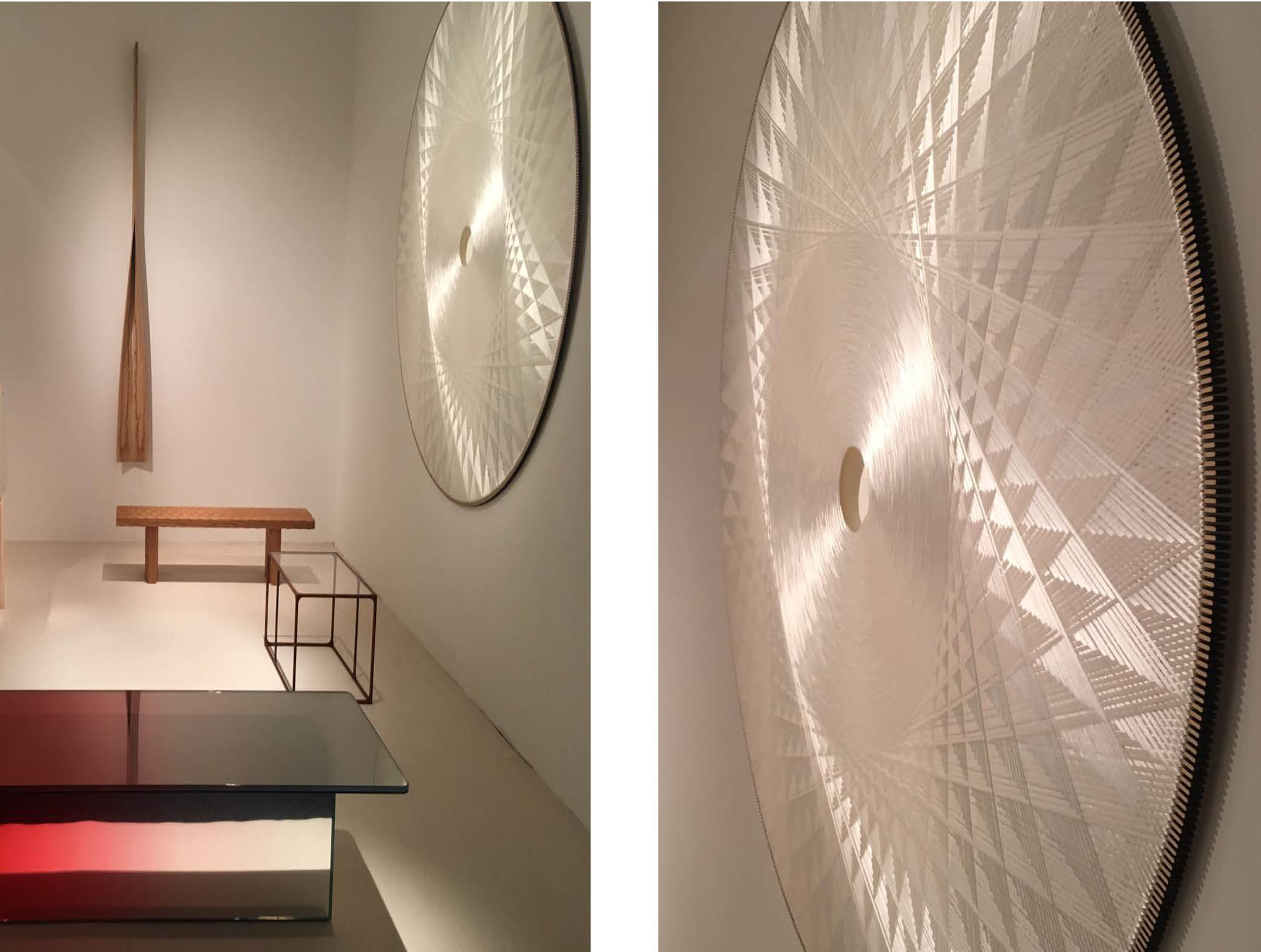
Another gallery that seduced us with intricately crafted wall pieces was Paris-based Maria Wettergren. Despite the fragile translucent quality, or perhaps, because of it, the textile sound-absorbing sculpture by CecilIe Bendixen created a powerful whirlpool of modern desire.
4. Soft Blues
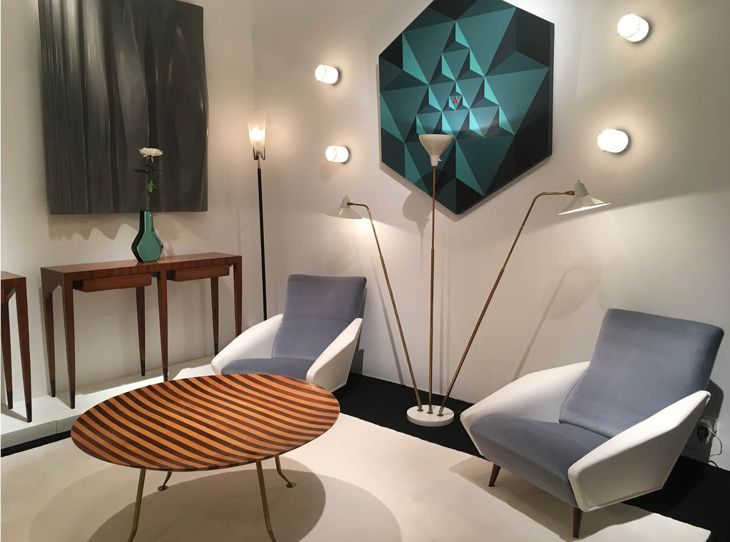
With the recent ado around award-winning blue, it comes as no surprise that the PAD presented us with some of its most delightful shades. Portuondo Gallery paid tribute to Gio Ponti’s heritage with the proud display of the bicolour pigeon blue and cream armchairs. Set against vibrant Art-Deco stripes and geometric patterns, they certainly caught our eye by the sheer power of clean, tranquil lines.
Galerie Mouvement Modernes presented a more conceptual take on this calming colour. Leaning towards each other in a shape of letter V, the assembled pieces seem to have created a peculiar magnetic field, which attracts and repels their straight lines from each other. For all its electric appeal, the whole ensemble basks in comforting dusky aura.
5. Frozen In Time
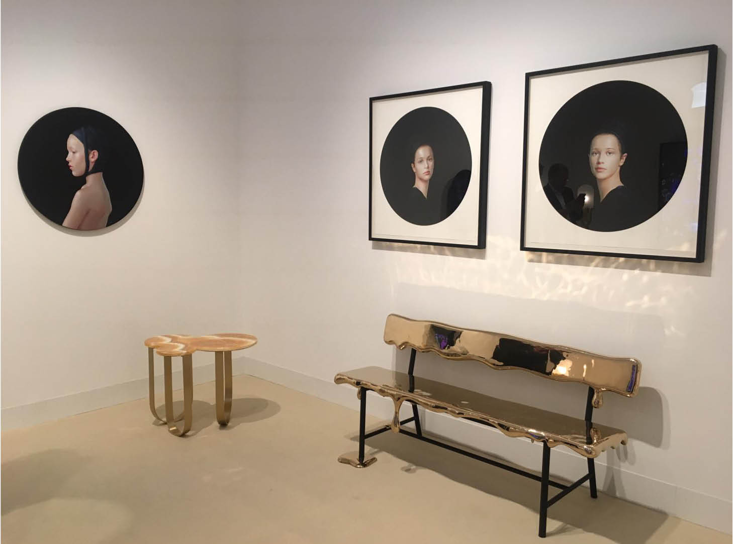
Immobilized in the perfect moment of creation, or perhaps dissolution? Until the last moment you are not quite sure, whether the paint on its surfaces is melting or solidifying. Such enigma lies in Reinier Bosch’s bench curated by the Dutch Priveekollektie Contemporary Art.
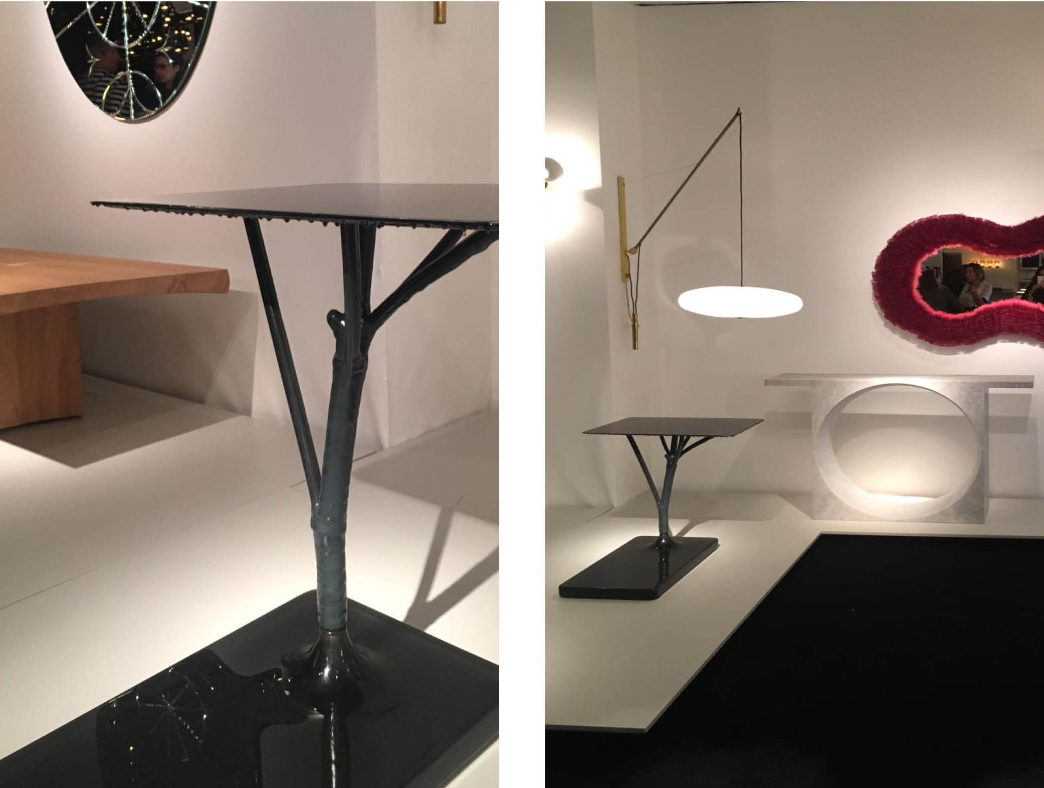
Morphogenic in nature, this ‘Frozen Hogweed Table’ by Studio Wieki Somers, caught our attention in the liminal space between fluid and solid. Melting within Galerie Kreo’s minimalist yet quirky landscape, this carbon fiber table pulls and stretches between matte and glossy finishes.
6. Fossilized Wonders
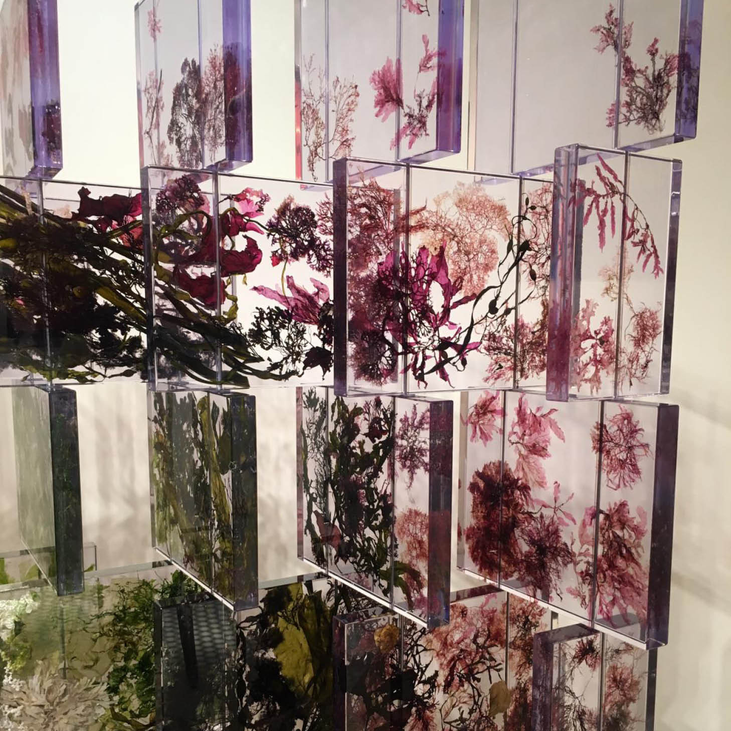
Ancient Egyptians used embalming to preserve pharaohs’ godly aura for the future generations. Today, their sarcophagi still hold secrets of the gone-by days. Some contemporary designers began to follow this path of immobilizing time with intention to preserve the wonders of our universe. Except, this time the exercise is purely aesthetic. Sasha Sykes collected seaweed specimens around the coast of Ireland to grant them immortality within translucent cold cast resin.
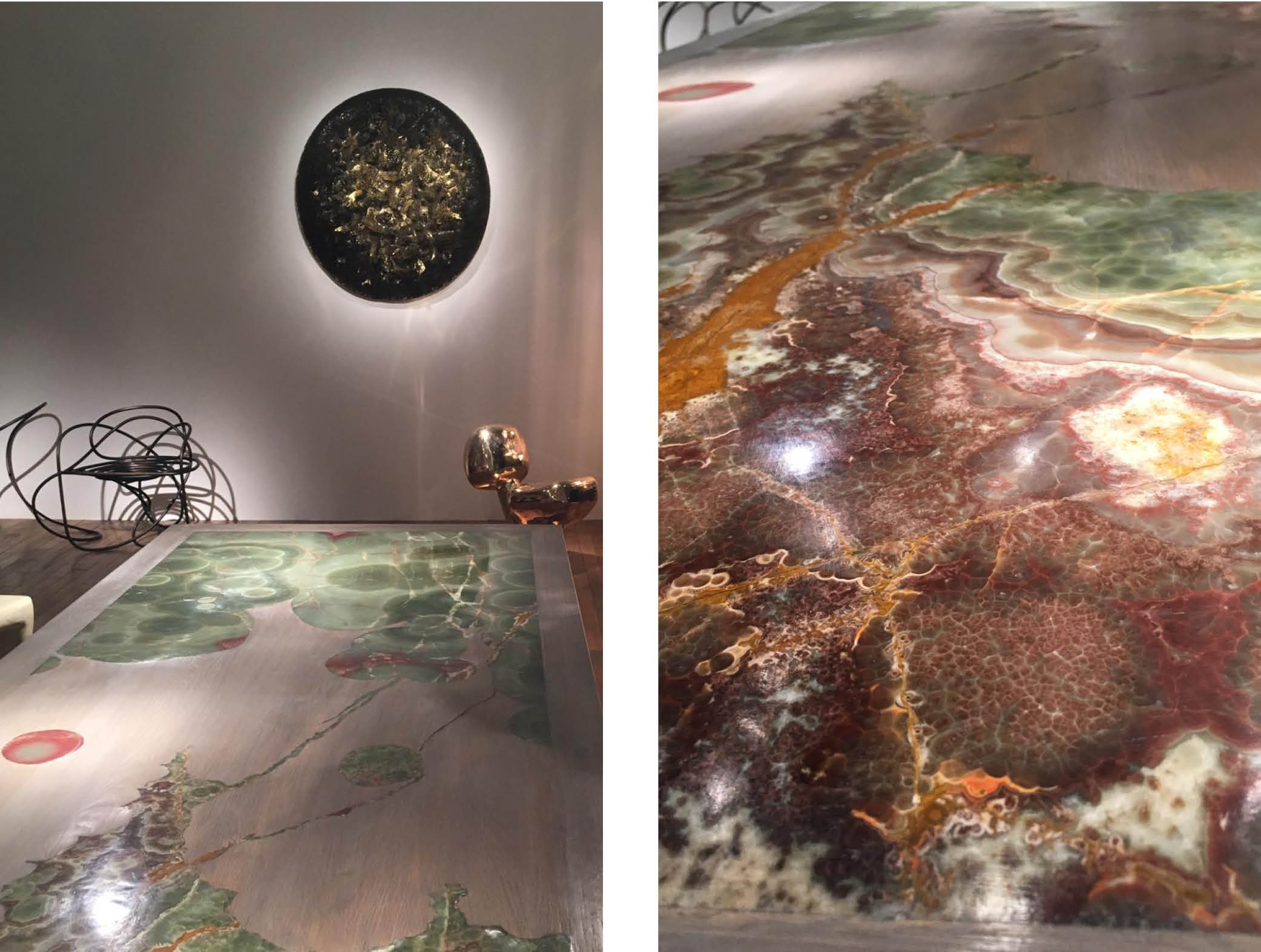
Tables lend themselves perfectly to the art of fossilizing beauty. One doesn’t have to necessarily focus on organic materials. Sometimes the inorganic universe presents an alternative that is just as striking. Francesco Perrini at FUMI nested translucent olive and golden-hued onyx in solid oak, which animates the table surface making it quite the modern heirloom.
Related articles
Wabi Sabi Design Principle
Learn all about the Japanese design philosophy, rooted in simplicity, authenticity and imperfection.
What Would Coco Do?
This week the V&A opens its fabulous new exhibition, Gabrielle Chanel: Fashion Manifesto.
Few would argue that Gabrielle Chanel was a true creative visionary, and in many ways she wrote the rulebook for contemporary style. Thinking of some of her most quoted wisdoms - we can't help but notice how relevant they also are for interiors...
Power Of Monochrome In Interior Design
We’re so thrilled to launch the Shakti Design Residency in India, a new annual initiative to support emerging international design talent.


