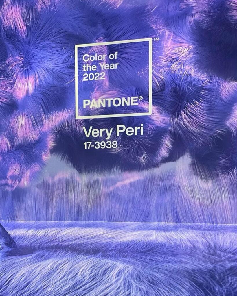
Hailed as the ‘symbol of the global zeitgeist of the moment and the transition we are going through’, the Pantone Colour of the Year 2022 is a dynamic blue with violet-red undertones. Very Peri, officially known as a PANTONE 17-3938, displays a ‘carefree curiosity’ and ‘daring curiosity’ that inspires creativity and vision.
Every 12 months, Pantone, the iconic provider of digital design solutions and colour standards, sets the tone for the year ahead with its Pantone Colour of the Year, and 2022 is no different. As we look to our surroundings for reassurance and inspiration, this year’s Very Peri provides the faithfulness and serenity of blue combined with the excitement and hubris of red. The result? An optimistic and empowering shade that reflects a new perspective and an ‘altered landscape of possibilities’.
A New Colour for a New Year
Interior designers, homeowners, and design enthusiasts look to Pantone to reflect our collective mood and each year, the design powerhouse shares its selection. In 2022, however, we really are being treated to something new. Pantone has created this year’s colour, Very Peri, from scratch, bringing us a brand-new shade at a time when we’re embracing a new world.
This is the first time that Pantone has launched a brand-new colour for its Colour of the Year educational program, and it is fitting that it’s for 2022. As we strive to find out place amidst an evolving landscape and we encounter new ways of living, Pantone’s fresh new colour gives us the confidence and reassurance we need to succeed.
What is the Pantone Colour of the Year?
Now in its 23rd year, the Colour of the Year educational program highlights a colour that colour standards powerhouse, Pantone, believe will be widely used. Based on data-driven insights and trends, the Pantone Colour Institute takes a scientific and creative approach to arrive at their choice.
Pantone is, perhaps, best known for its Colour Matching System. Encompassing more than 2,100 different shades, Pantone effectively standardised these colours, so that printers and manufacturers could recreate the shade seamlessly, regardless of what equipment or processes were used. Since then, its Colour Matching System has also been ubiquitously online and in the world of digital design.
However, its Colour of the Year program has taken on a life of its own and its annual release is a key date in the diaries of interior designers, graphic designers, packaging designers, manufacturers, fashion designers and many other types of creatives. Running the gamut from digital art to physical objects, you’ll find that a wide range of artisans, designers and manufacturers incorporate this year’s Colour of the Year, Very Peri, into their work in 2022.
Pantone Colour of the Year in Interior Design
If you want to stay on-trend and use your surroundings to reflect the changing times, incorporating the Pantone Colour of the Year into your interior design is a savvy choice. Whether at home or work, you’ll find spaces that can benefit from the attributes of Pantone’s appointed shade and, as a result, you’ll be able to identify where and how to use Very Peri.
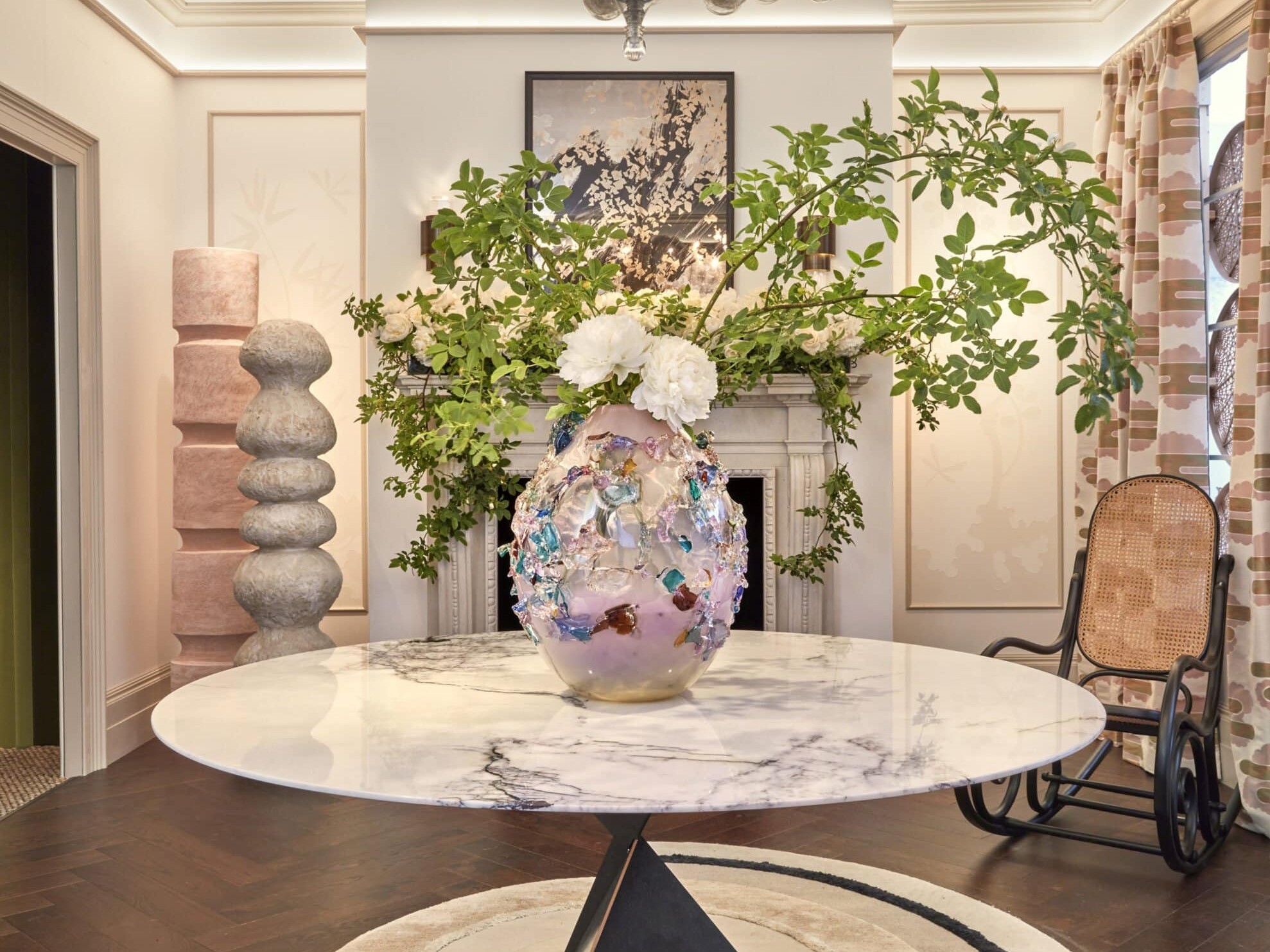
When it comes to interiors, Very Peri injects a ‘sense of playful freshness’, which can be maximised through ‘unusual combinations.’ Whether it’s in your living space, office or bedroom, the creativity and positivity associated with Very Peri will elevate the space and ensure your surroundings spark joy, fun and curiosity.
Incorporating Very Peri into Your Colour Palette
As well as releasing its Colour of the Year, Pantone helpfully publish suggested colour palettes to accompany their selected shade. If you’re looking for inspiration, this can be a useful way to discover which colour combinations can be used to maximise the impact you want to create.
If you want to blend Very Peri to create a natural, soothing palette with a hint of liveliness, for example, balance its confidence with Burnished Lilac, Lotus, Muted Clay, Dried Moss, Granite Green, Hawthorn Rose or Elderberry. A mixture of cool and warm tones, you can use Very Peri to enliven a tranquil space when you combine it with these stoical shades.
Alternatively, incorporate Very Peri into a palette of neutral classics and make it the ‘Star of the Show’ Amidst Anthracite, Volcanic Glass, Deep Taupe, Plaza Taupe, White Sand, Petrified Oak and Cloud Dancer, Very Peri is a ‘dynamic presence’ that adds a boldness to a timeless and classic palette.
When fun is a top priority, Very Peri works exceptionally well in conjunction with other joyful and whimsical shades. Tawny Orange, Pink Flambe, Iced Coffee, Fuchsia Pink, Paradise Pink, Cornsilk and Tourmaline harmonise well with Very Peri, elevating its vibrant playfulness without overpowering it.
For spaces where you want to mimic the outdoors and inspire wellness, add Very Peri to green-inspired shades. The quiet consistency of Chai Tea and Dewberry, in conjunction with the nature-infused shades of Treetops, Greenbriar, Foliage and Celery, and the lighter shades of Eggshell Blue and Very Peri, work effortlessly together to generate a holistic and nurturing colour palette that will revitalise and restore.
Where to Use the Pantone Colour of the Year
At first glance, Very Peri, might seem like a tricky colour to integrate into your existing colour scheme. However, the solid consistency of its blue hues and the spark of fun associated with its violet undertones make this a fantastic colour to have around you. What’s more – the range of colour palettes outlined above show just how easy it is to incorporate this innovative shade into any environment.
From a contemporary, open-plan living space or a snug den to a home office or a shared workspace, you’ll find that Very Peri has something to offer. Whether you choose to make the Pantone Colour of the Year your base colour or use it to add contrast and depth to an existing colour palette, the courage, creativity, imagination and optimism of Very Peri will nurture and embolden you as you embrace a new world and a modern era.
Related articles
Small Room Ideas and Small Space Design
Our tips for maximising a small room, considering reflective surfaces and neutral tones.
Home Staging and Styling To Help Sell Your Home
We uncover the strategic design and decorating tips to increase your chances of a quick sale.
Wabi Sabi Design Principle
Learn all about the Japanese design philosophy, rooted in simplicity, authenticity and imperfection.


