We go darker, moodier and more dramatic. And it’s not only because summer came to an end. Moody glam resonates with a rich visual density all year long. Caviar Black, Emerald Green, Mauve Purple, Truffle Brown, Midnight Blue or Deep Turquoise – we introduce to you our favourite shades this season.
Caviar Black
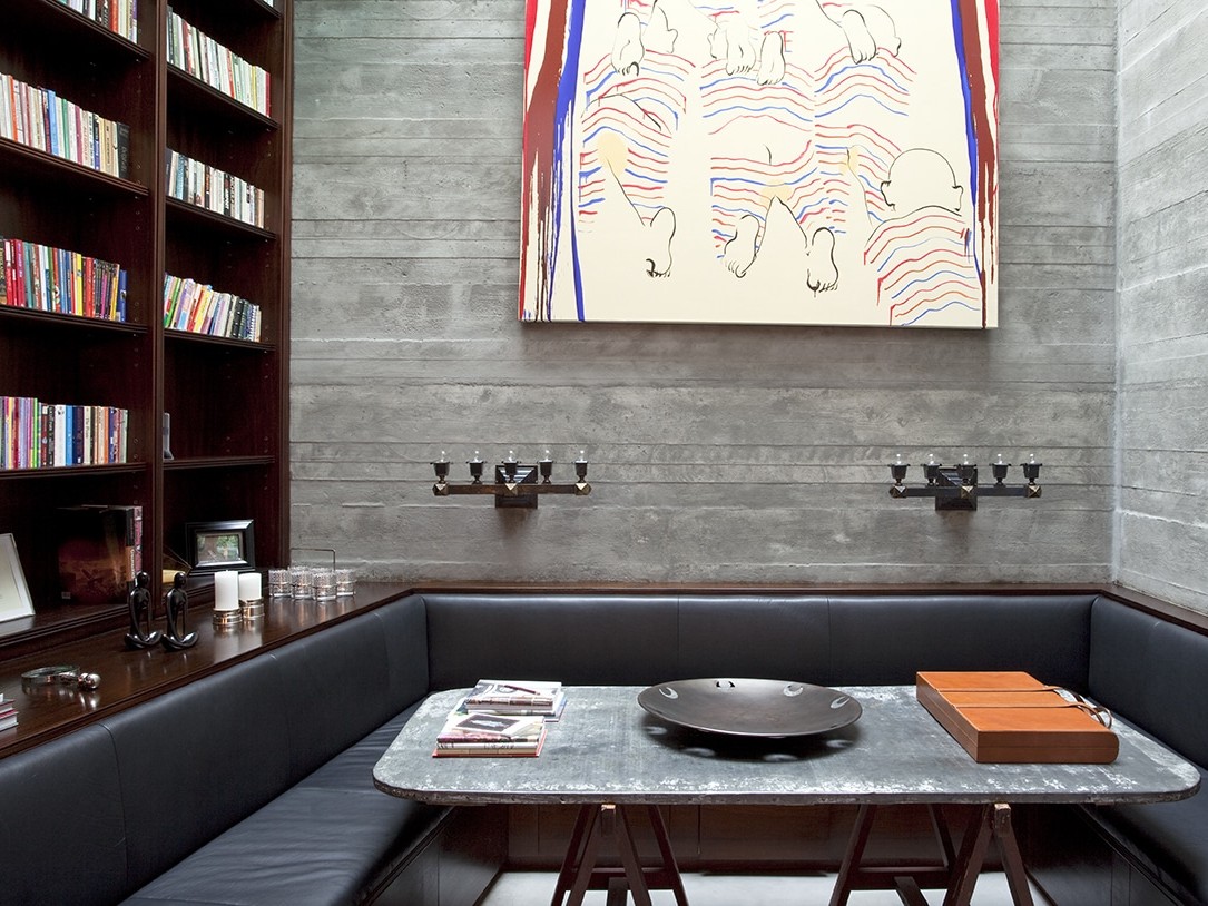
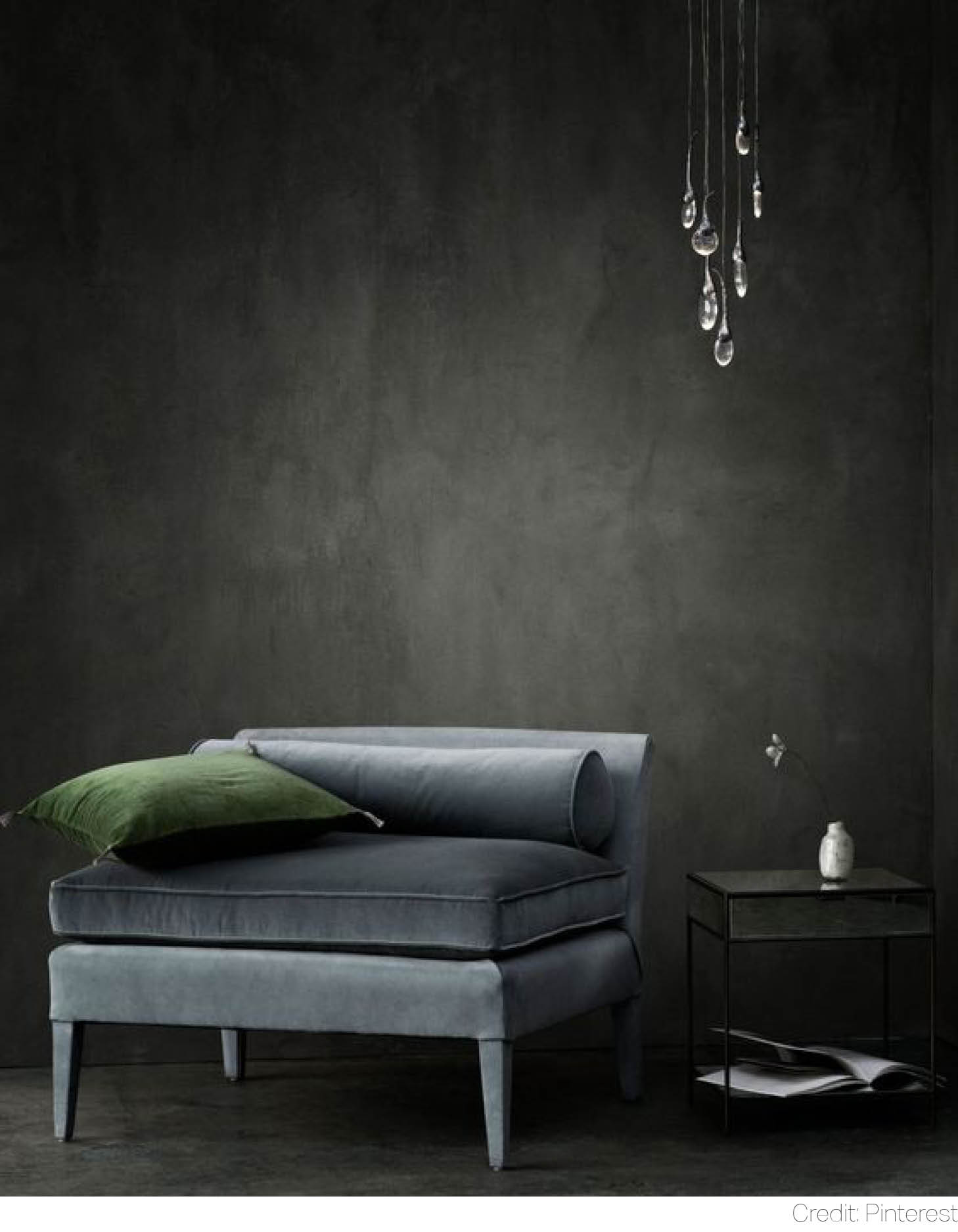 Being one of the most anticipated shades of 2019, Caviar Black hypnotizes with the strength of its masculine luxe. Set on the cusp of charcoal, it is unapologetically effortless, thus allowing for more monochrome configurations just like in this Chelsea home.
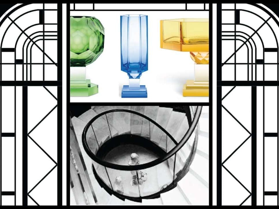
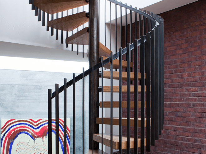
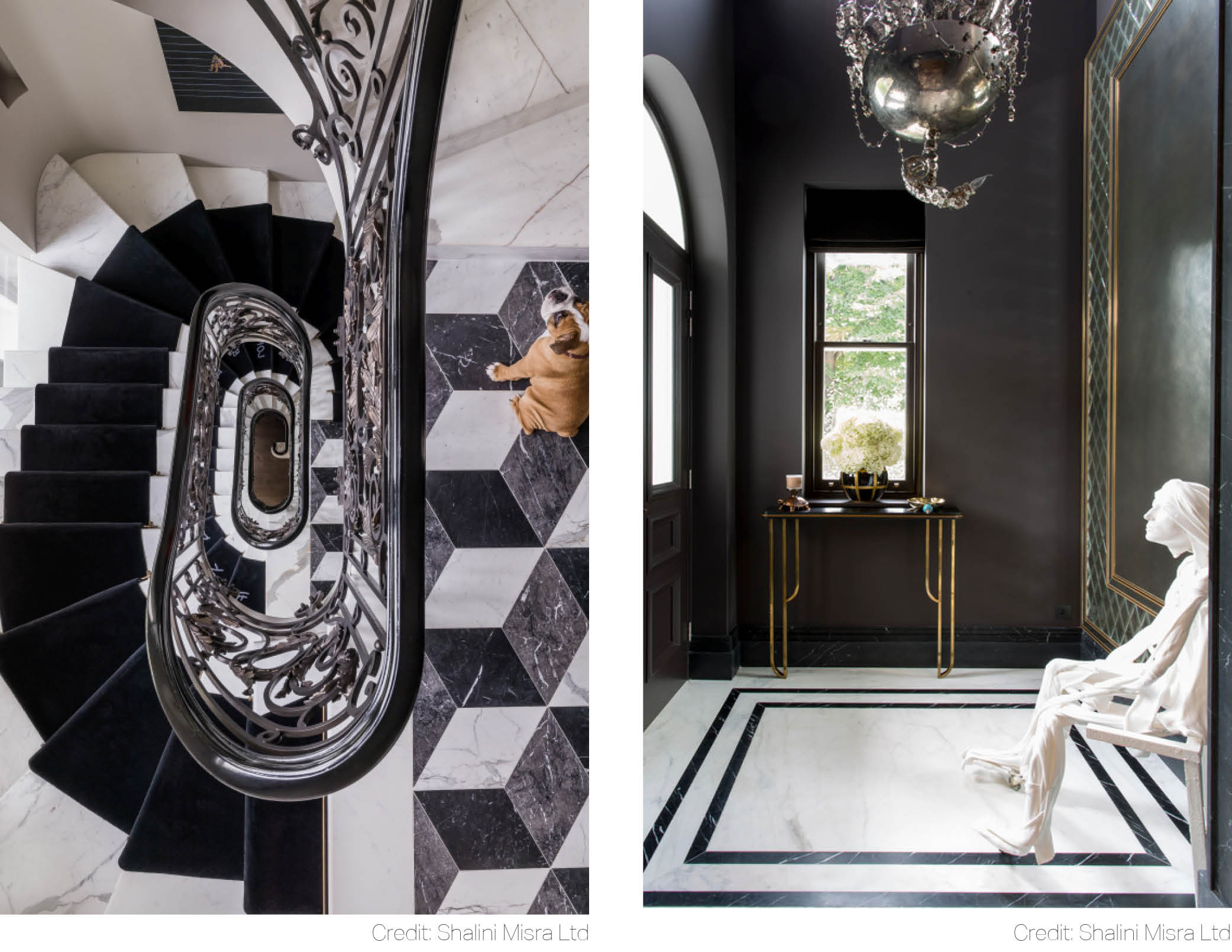 Straight sharp edges of the mirror and geometric precision of the marble floor tiles have been superbly softened by the voluptuous curves of the spiral staircase.
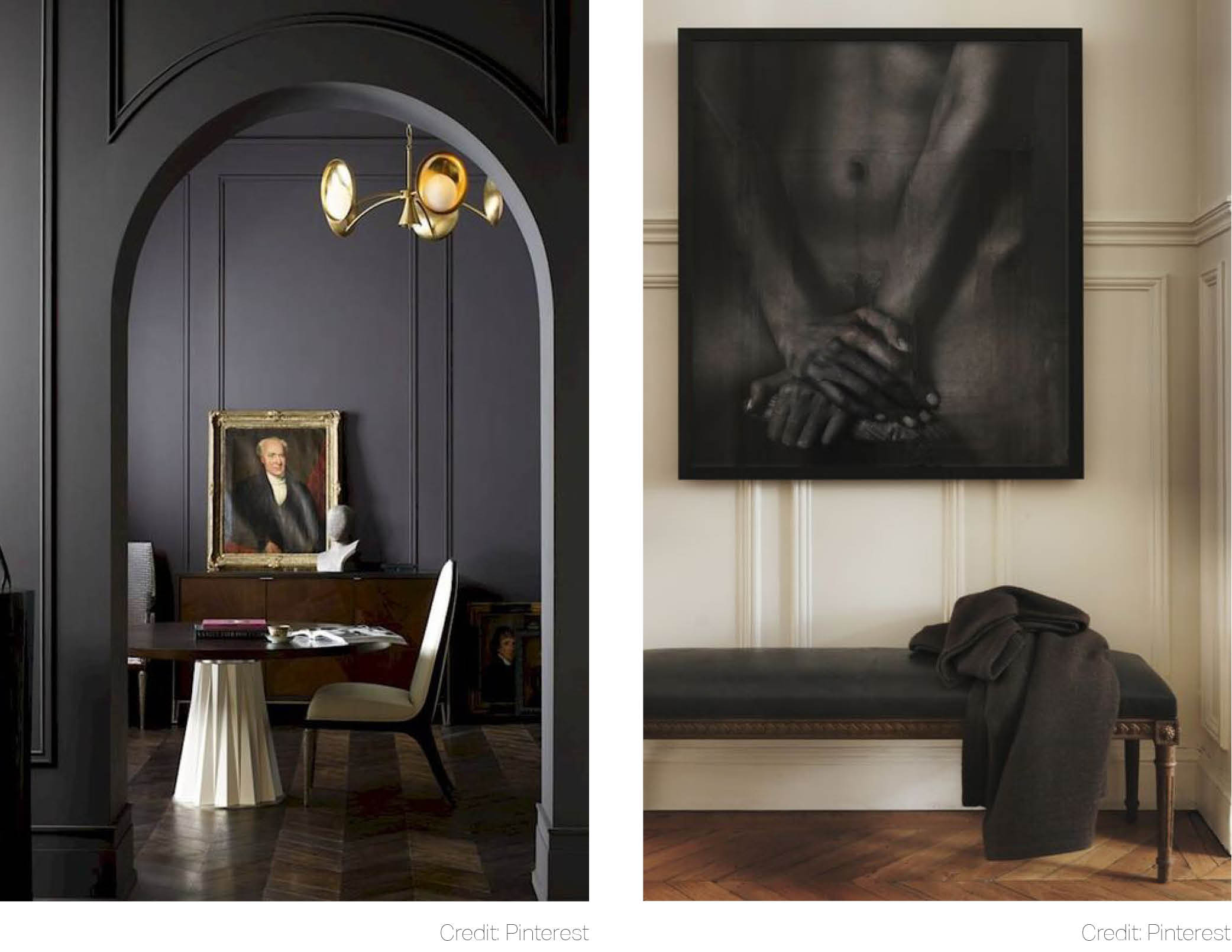 Dramatic experience right from your doorstep? With Caviar Black you can welcome your guests in spectacular style. Hallways don’t need to be merely a transition space. They can speak with their own confidence. If an all-four-walls makeover is too much for your senses, reverse the pattern: set the walls in light and scatter a few accents of charcoal around.
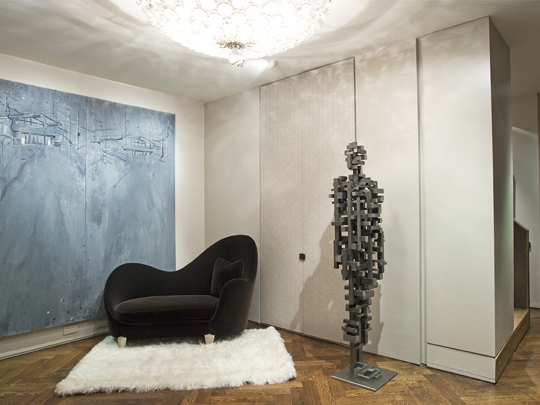
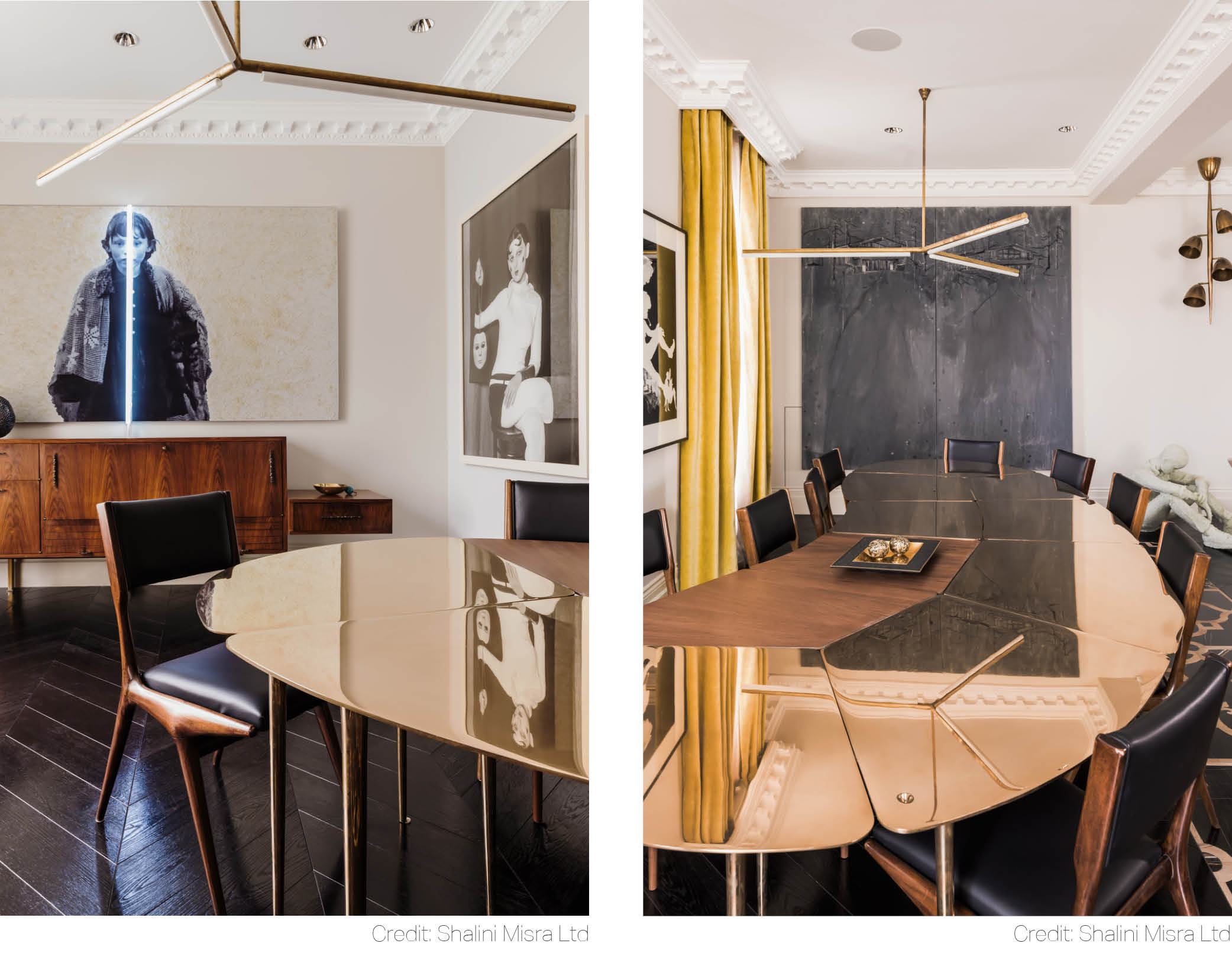 Whether intentionally or not, Caviar Black often has a minimalist sexiness about it. This Chelsea apartment is testimony to that: sleek black Carlo di Carli vintage leather chairs flirt nonchalantly with a playful modular dining table in solid bronze and mahogany. To break the metallic finish, golden-yellow, plush velvet curtains have been brought into play.
Mauve Purple
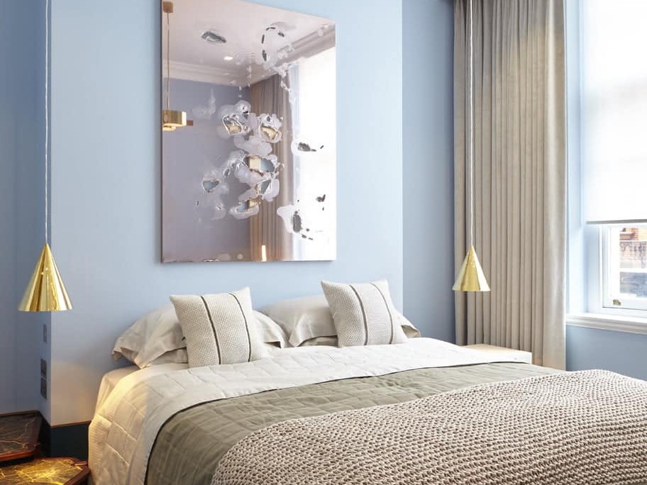
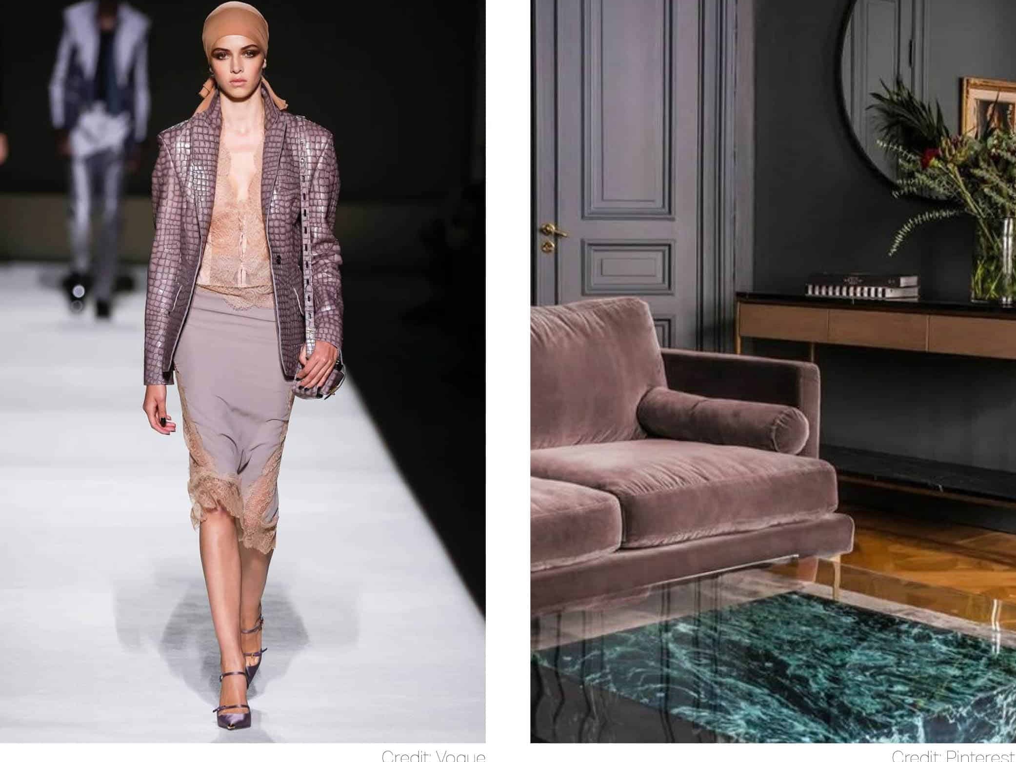
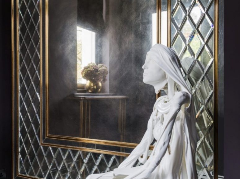
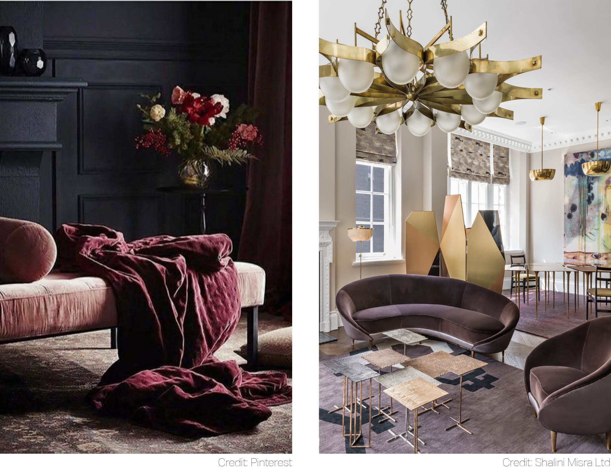
Hot Millennial Pink can move over. There is a new thrilling shade in town: Mauve Purple. Dare to go moody with this pensive shade. Add gilded partition screens for dimension and resonance just like in this Mayfair apartment. Accumulation of layers and materials allows here for two things: boldness and vibrancy.
Truffle Brown
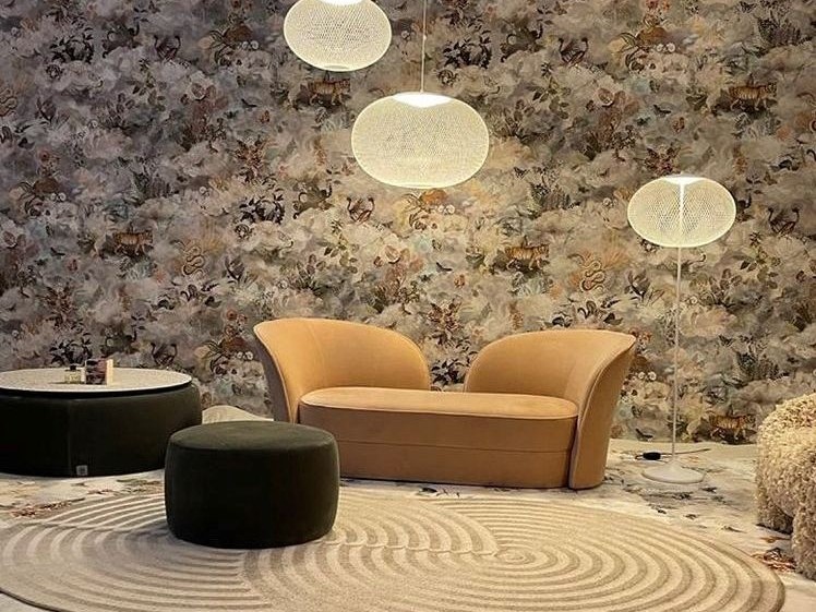
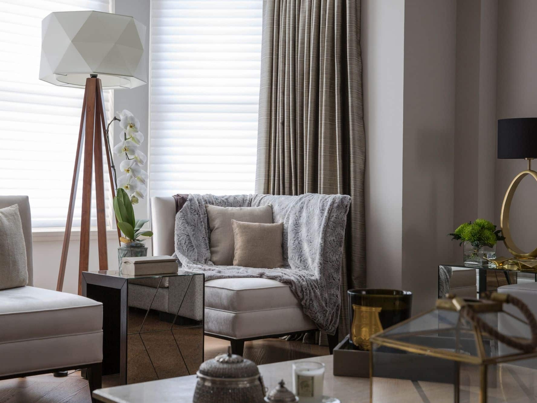
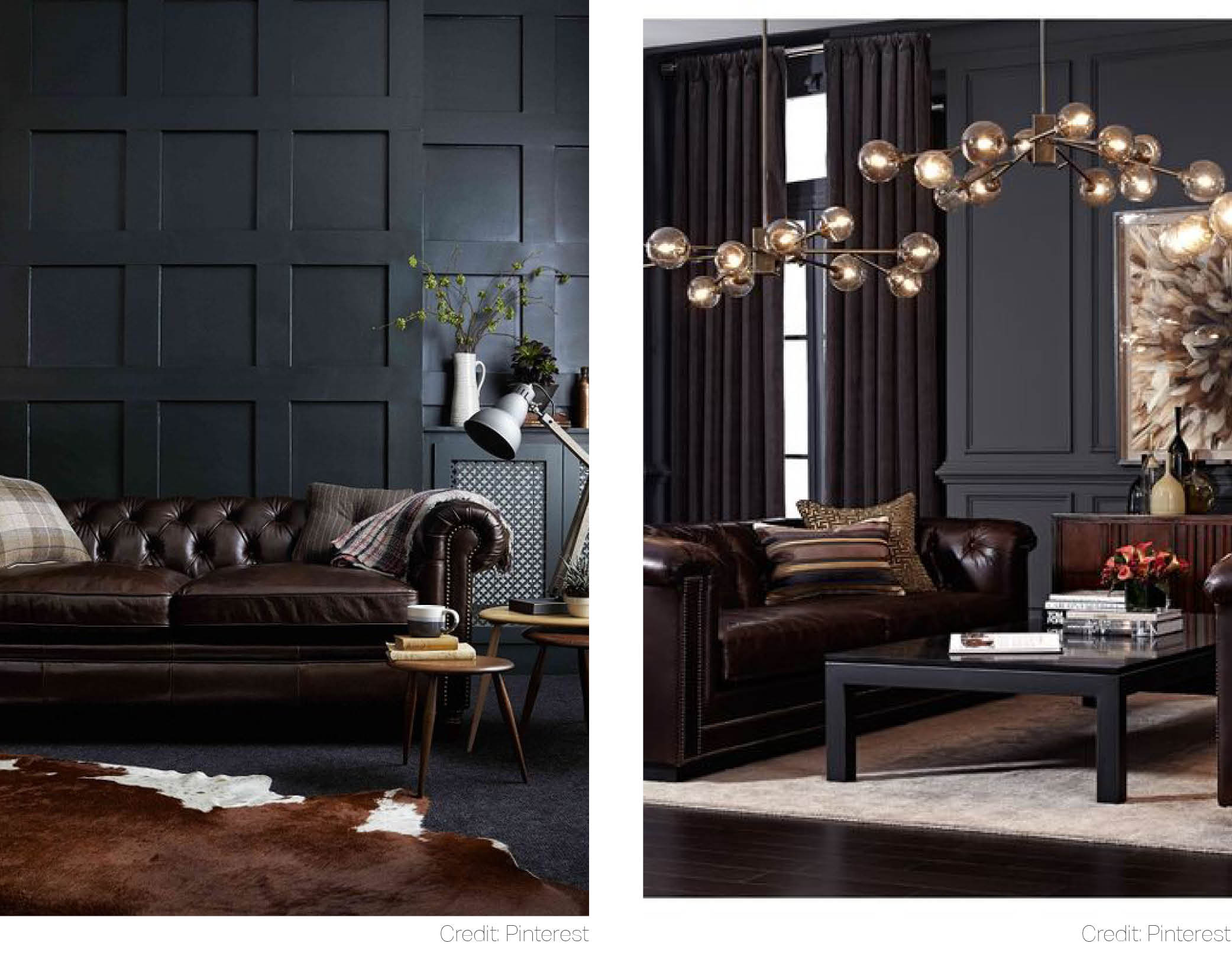
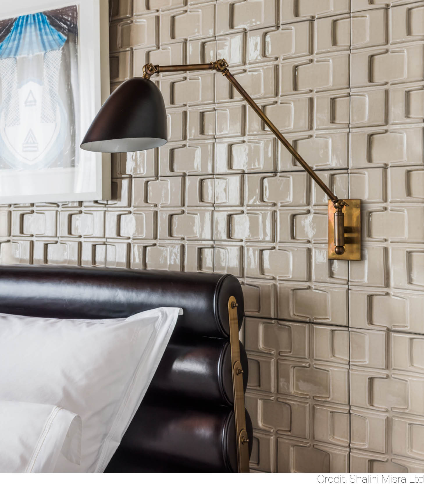
The season for truffles may only last from October till late December, but we yearn for this delicious shade in our interiors all year long. Whether you pair it up with a cowhide rug or gilded statement lighting, Truffle Brown will season any room with a pinch of gourmet gravitas.
Midnight Blue
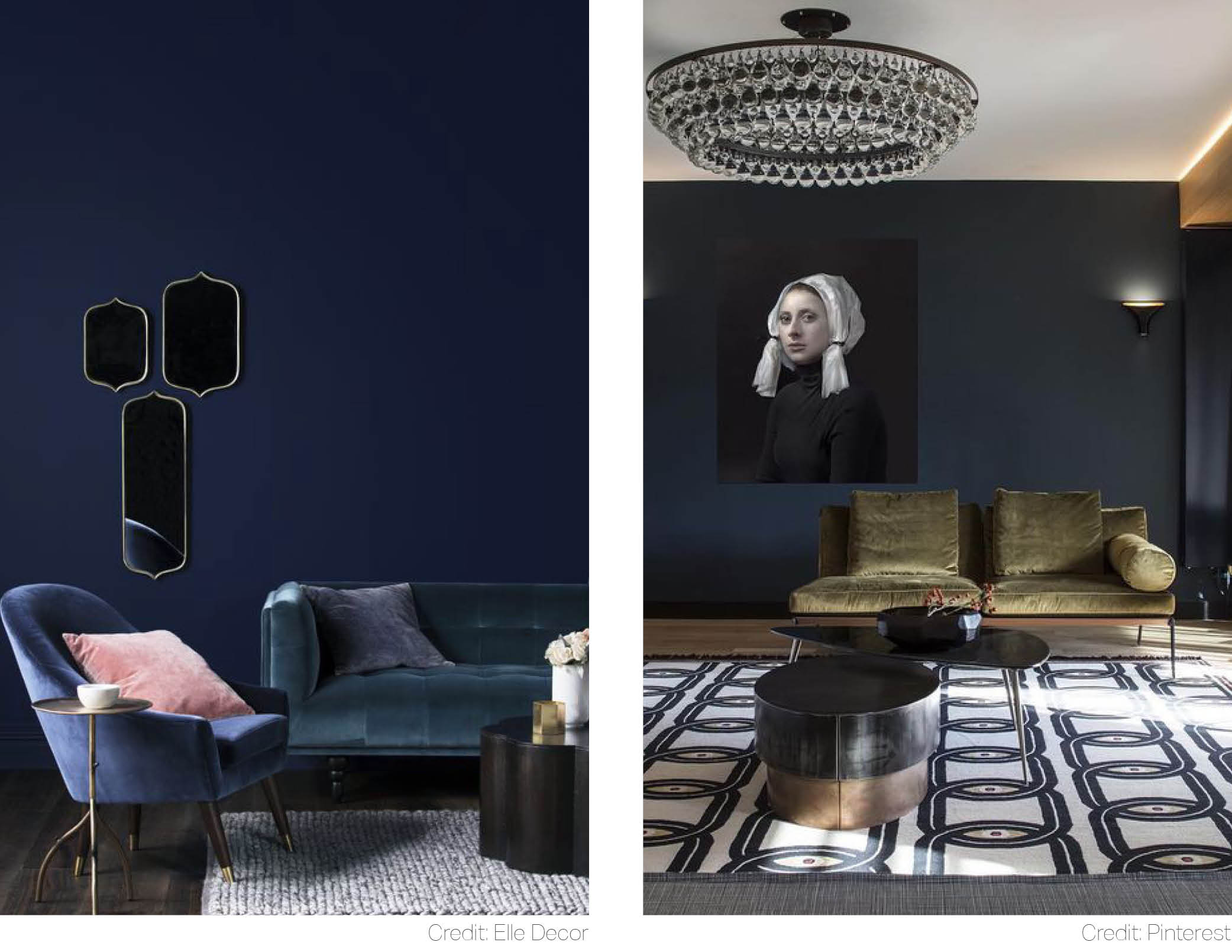 That’s how eyes operate: when we see a colour, it is really a light reflected off the object’s surface and cast upon our retinas. Colour is not inherent in objects and the end result is always created through a mix of red, green and blue. Yes, blue is a special colour. No wonder why designers are so relentless in extracting and naming its ever-evolving shades. An experienced eye is often needed to tell the difference between Midnight, Ink or Sapphire Blue.
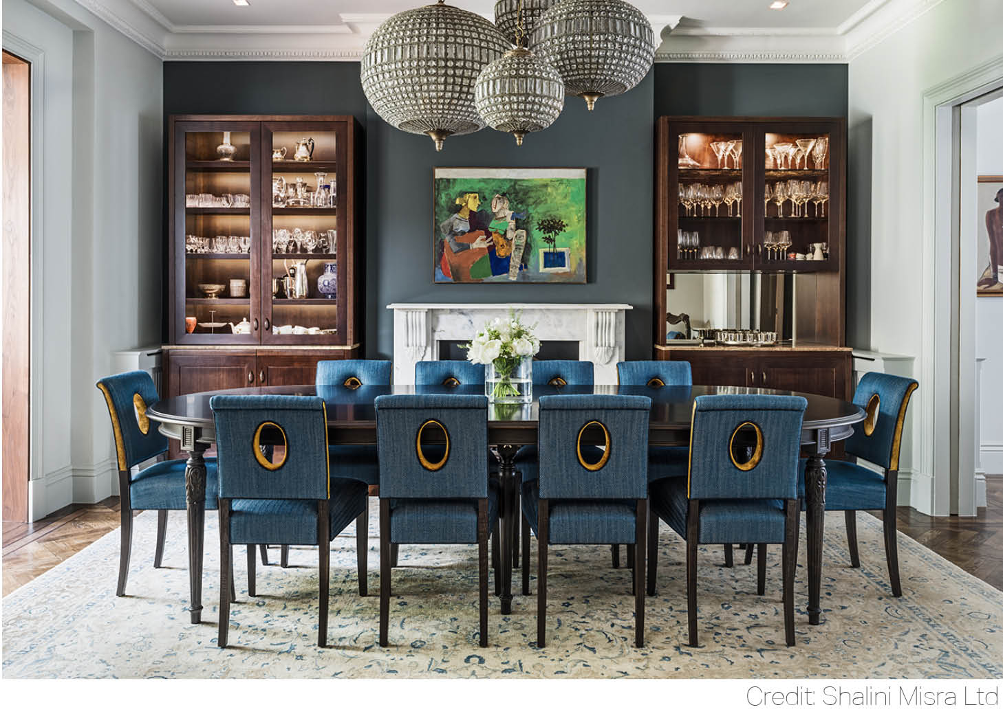 Finding the right depth of this thoughtful shade was certainly worth the effort in this Hampstead Place dining room. Sit back and watch a chain of Midnight Blue bids dancing elegantly around the table.
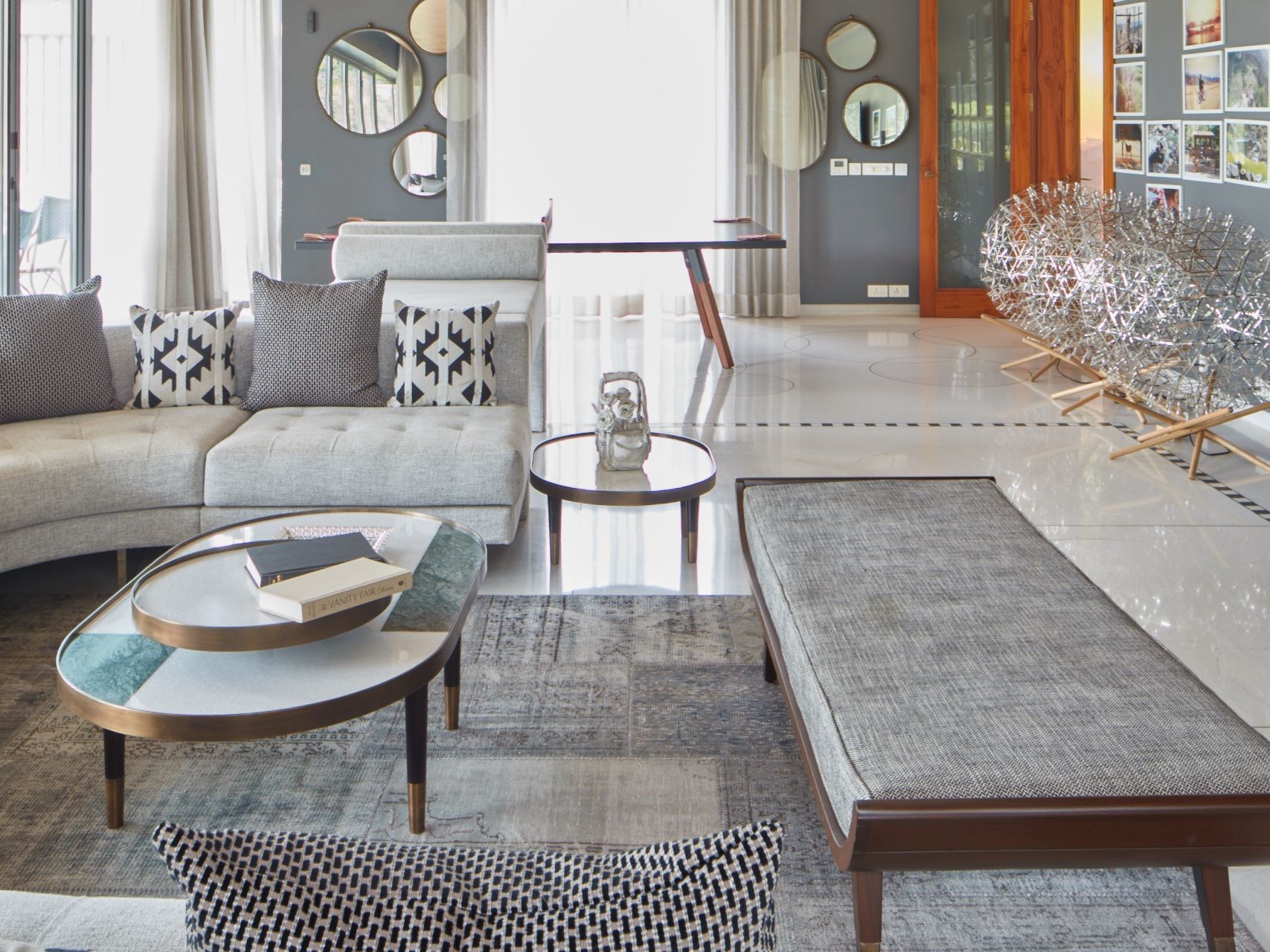
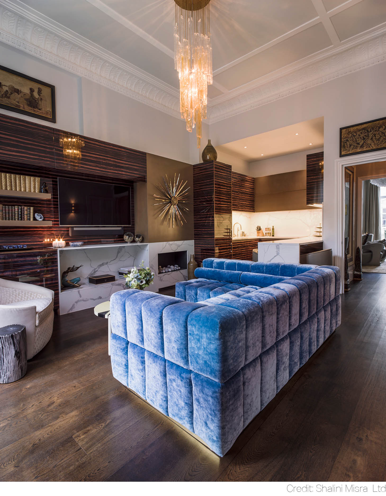 Now, that’s a combination. A geometric sofa, set into the deepest, almost luminous shade of sapphire stands in a striking contrast with a high gloss mahogany wall. Add sumptuous velvet and white marble to the mix, and no one could compete with the texture boldness of this Eaton Place wonder.
Deep Turquoise
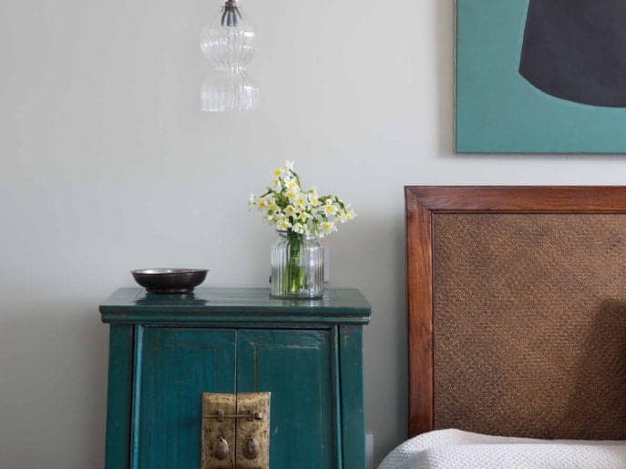
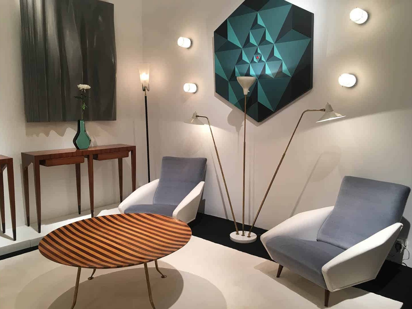
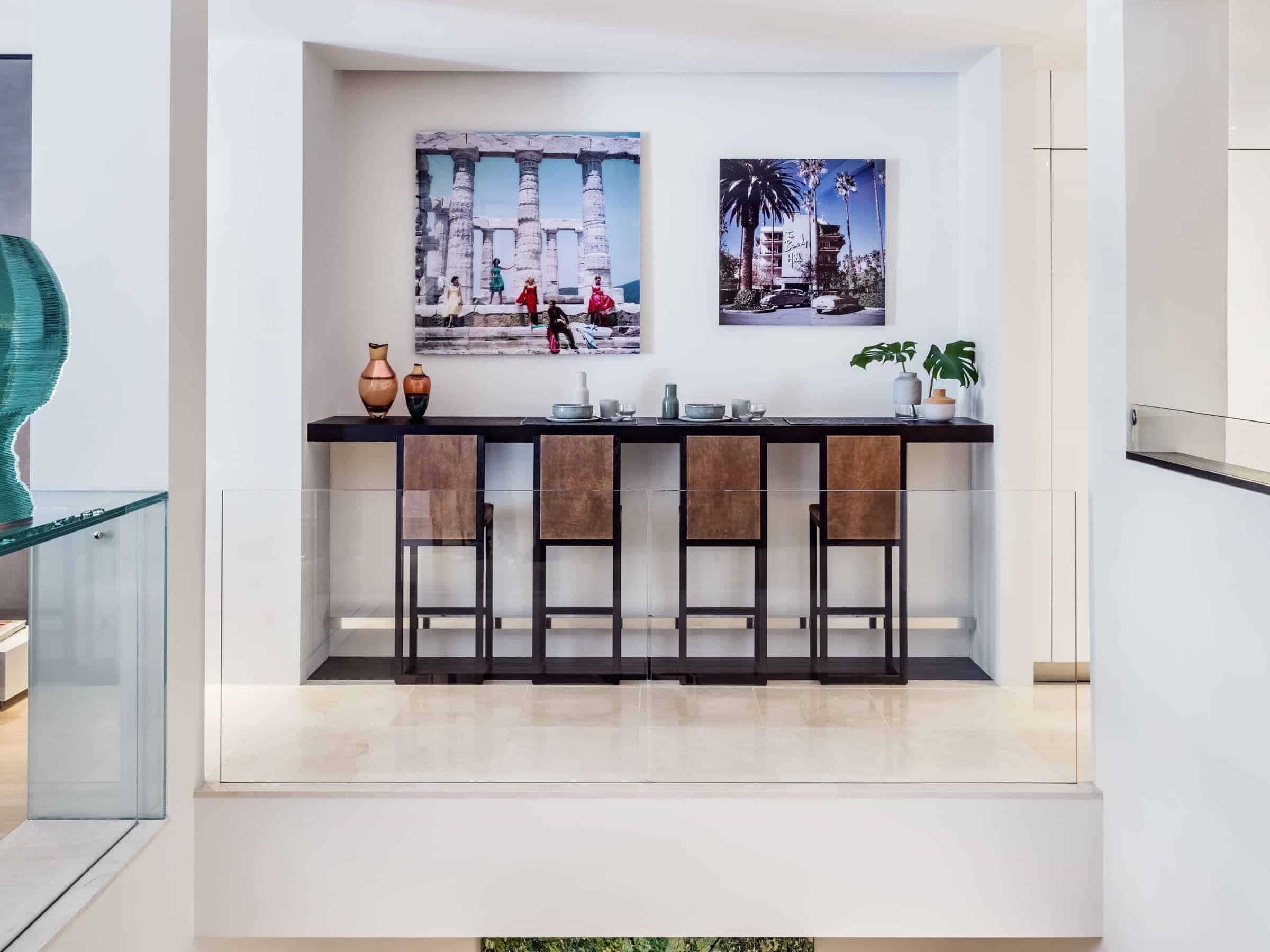
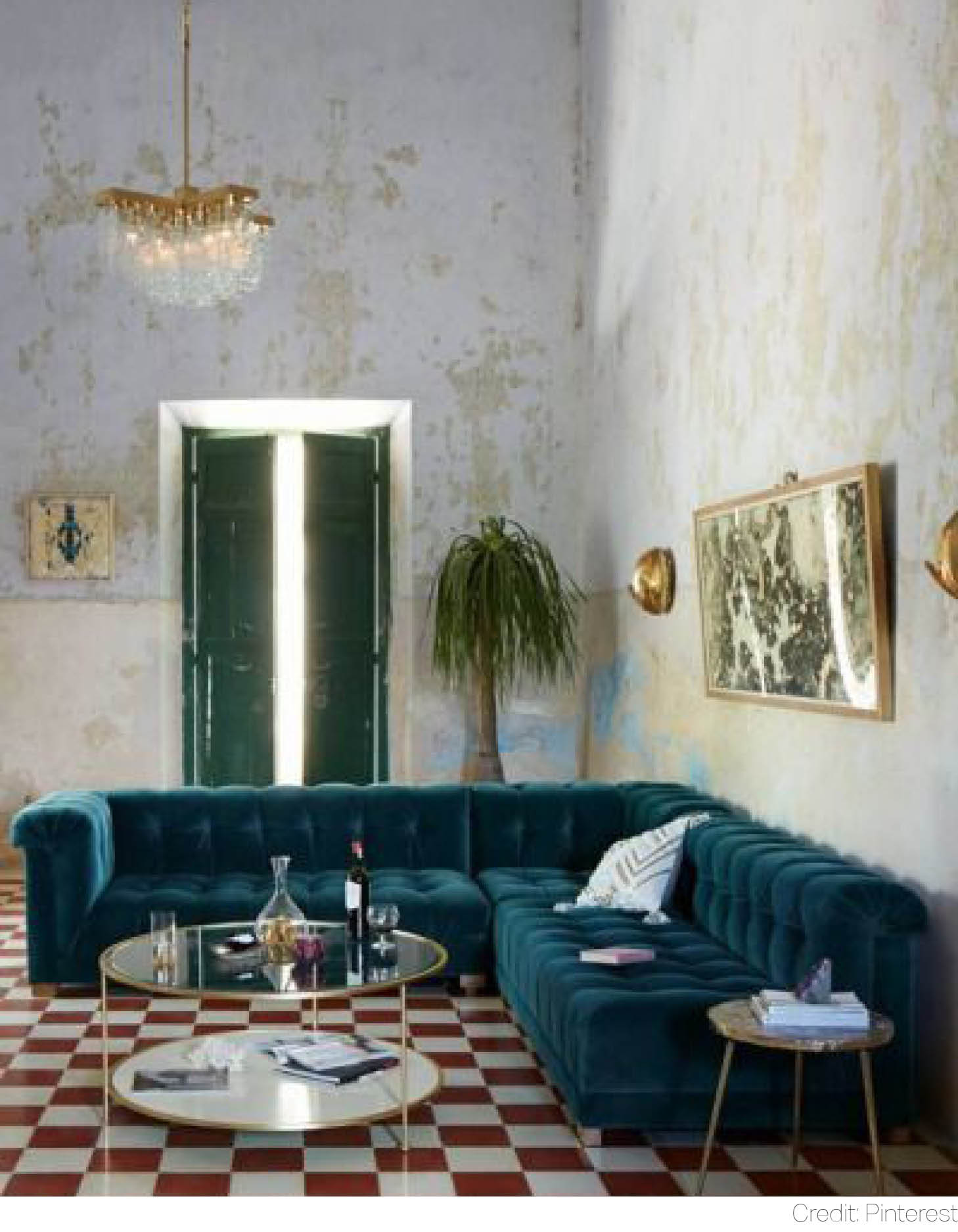 We all love a classic combination of crystal clear turquoise with copper gold, which always remind us of those sun-kissed moments by the translucent waters of the Caribbean. There is no denying turquoise is yet to surprise us with new colour schemes. This time, we revisit the retro days of Havana’s most glamorous establishments. Redwood-and-cream floor mosaic and patinated bronze mirrors still remember the old tales of rum and salsa.
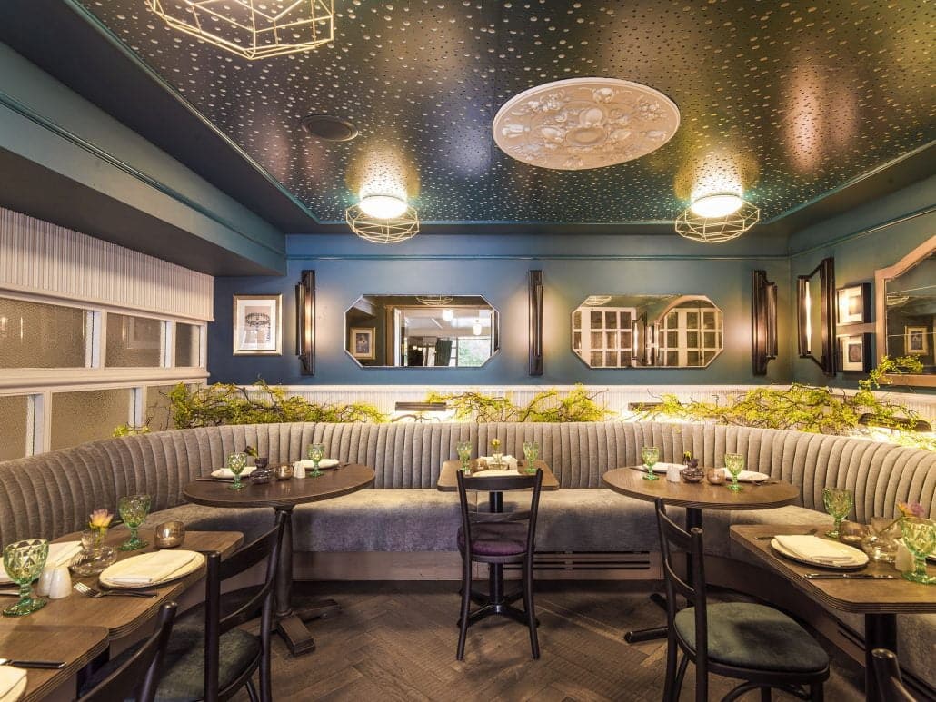
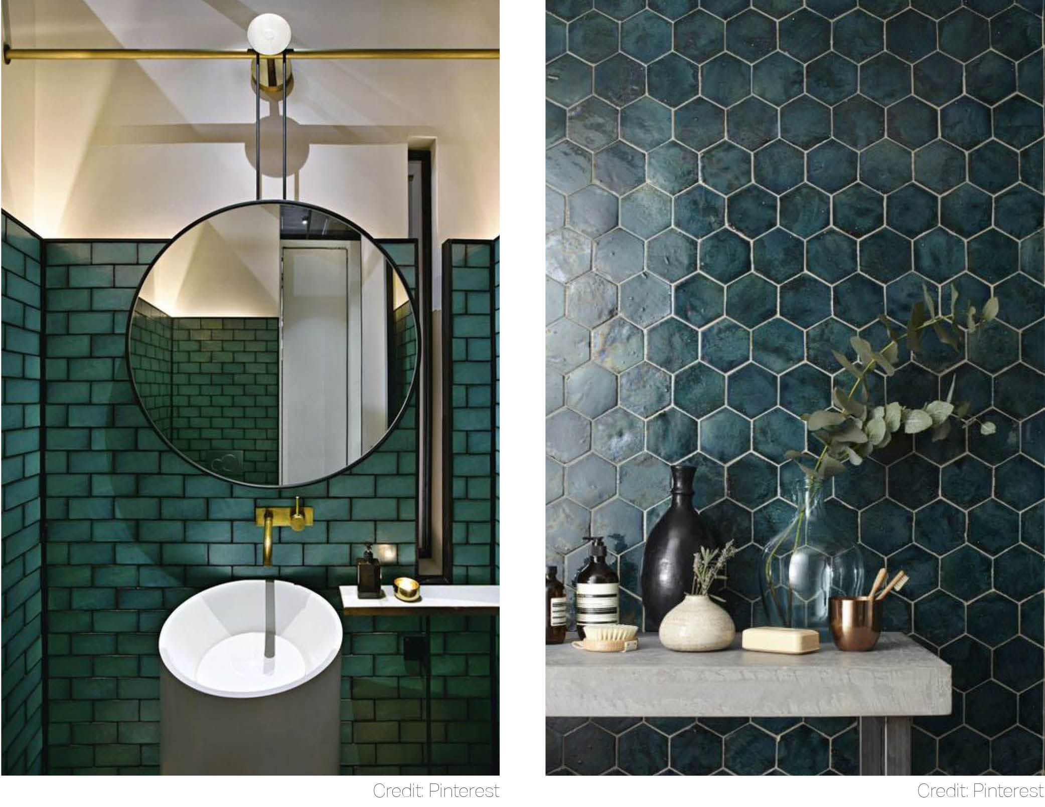 Craving more drama? Let’s go deeper and darker with black and gold geometric accents. Austere yet cosy, such is this luminous turquoise powder room where ovals live in harmony with rectangles.
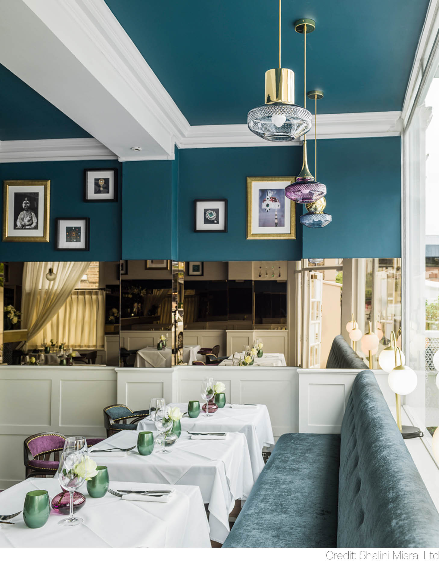 In Indian thought, turquoise is a colour of Vishuddha, fifth chakra of spiritual power within the human body, which symbolizes self-expression, creativity and truth. This trio sums up Shalini’s most recent commercial project. Chakra, a newly renovated restaurant in the heart of Kensington, brings us creativity and authenticity. To help reimagine the space, vibrancy of deep turquoise has been paired up with a 360 degree bronze mirror wall and the concept of Navaratna, a Sanskrit compound for “nine gems” – Ruby, Pearl, Red coral, Emerald, Yellow sapphire, Diamond, Blue sapphire, Hessonite and Cat’s Eye – that sparkle up tableware and glass design.
Emerald Green
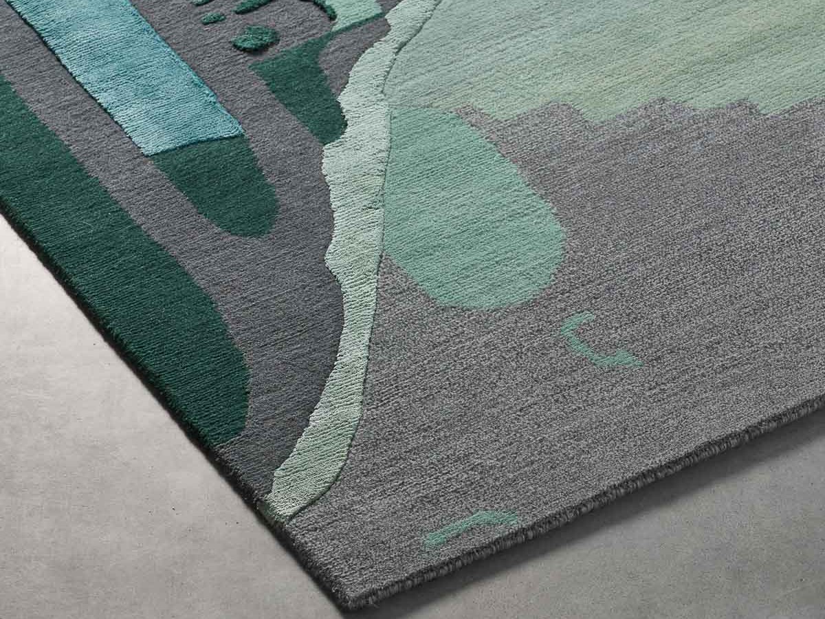
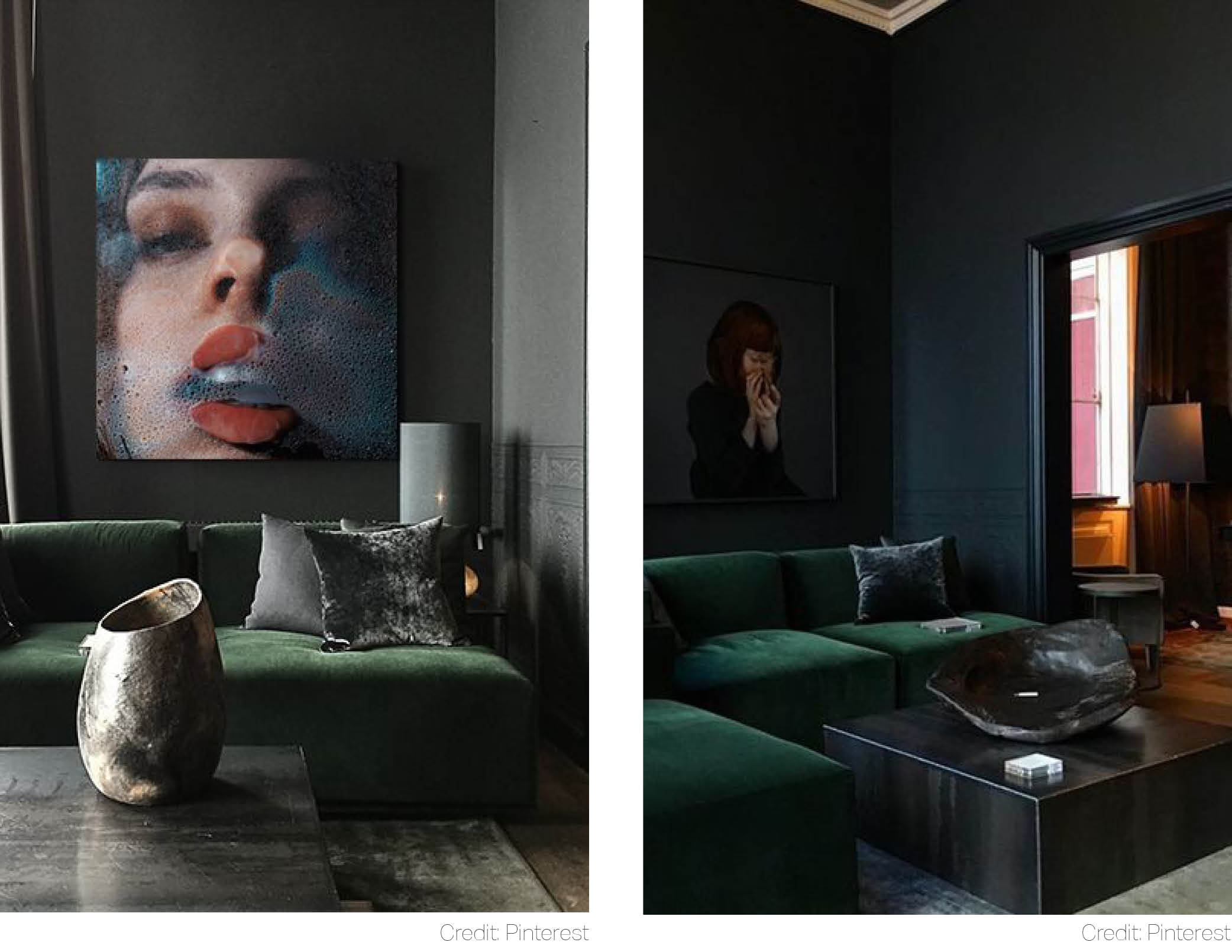 Did you know: green is the colour of harmony? Feeling collected is not only a state of mind. It starts with a state of our interiors. Why not add a sense of regal opulence to the equation? This leaves us with only one result: Emerald Green.
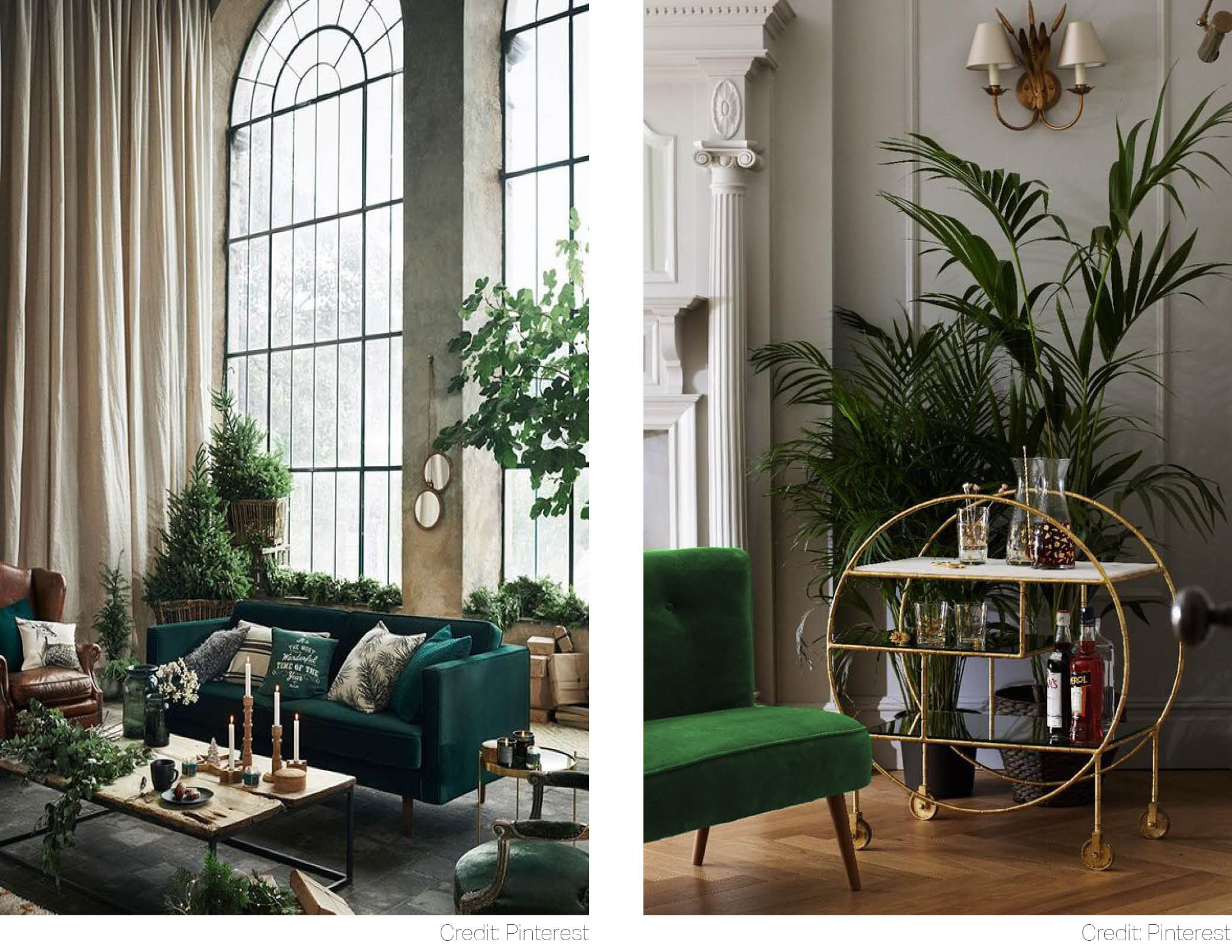 Dissolve into a majestic experience of emerald’s fertility. One moment in this spectacular drawing room will help you to recognize nature as shelter and a symbol of potency.
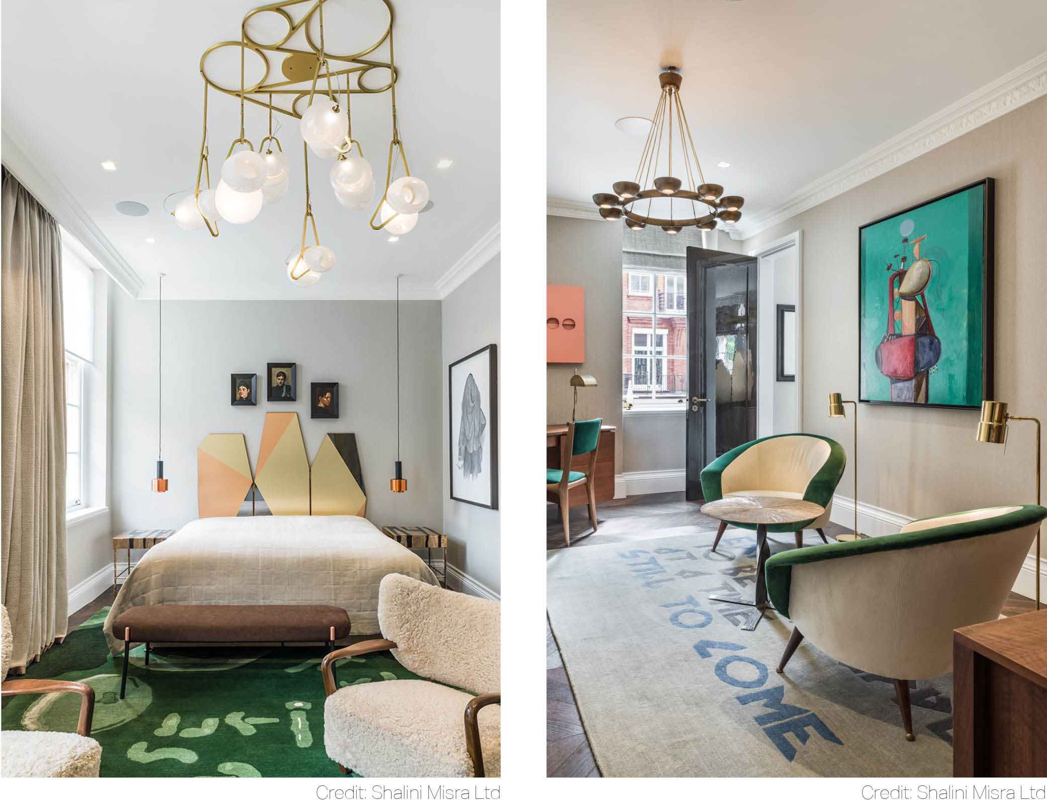 Emerald Green is designed to stand out. It doesn’t scream to be noticed like many of its Hot Millennial cousins. It hypnotizes instead. The depth of this bold yet dignified colour can be admired in this Mayfair apartment, where accents of green have been scattered around with panache.
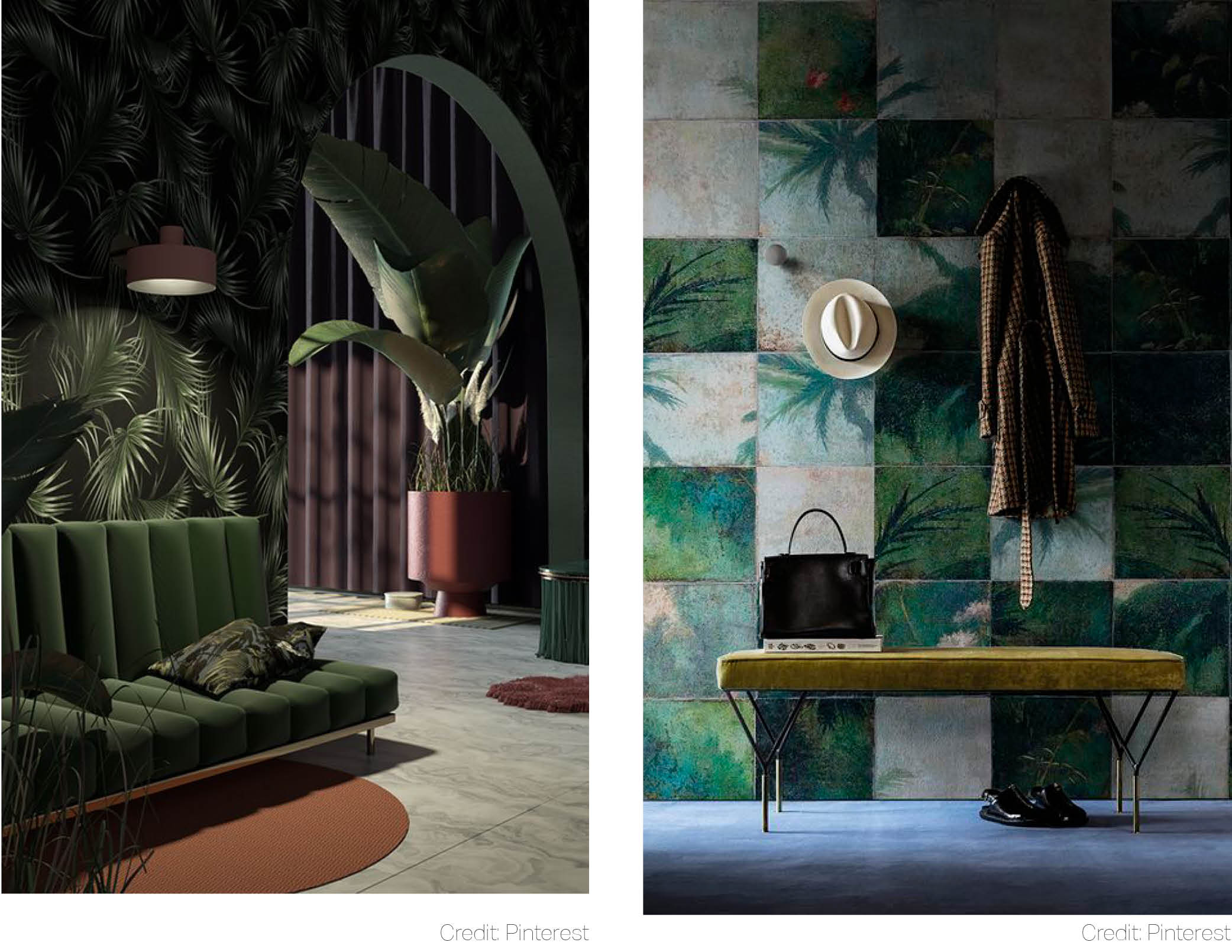 And finally, a throwback to all those exotic adventures that summer brought us this year. Except, this time tropical luxe is being given a moody face. Dim the lights and add a sense of eternity to the space. Try ochre and orpiment– after all, they are the oldest tints used by humans.
Related articles
Conversations on Design: Shalini Misra and Fabrizio Cantoni
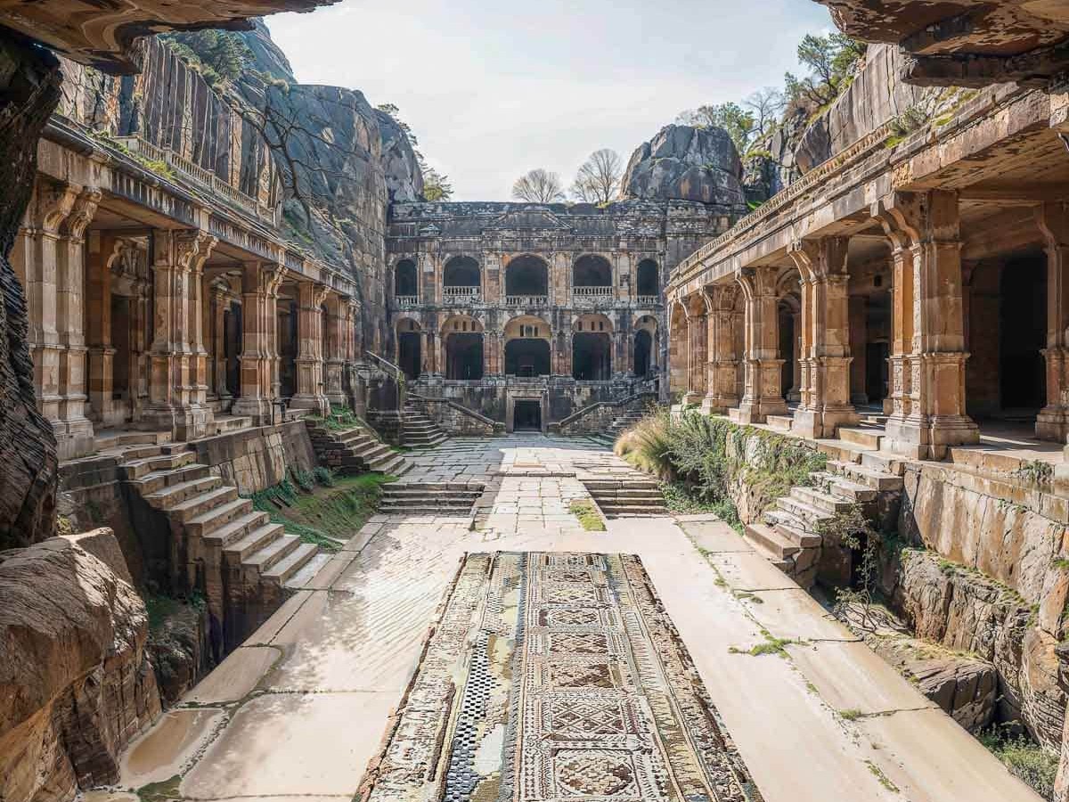
Shalini Misra & Fabrizio Cantoni from cc-tapis deep dive into the cultural significance of stepwells, the creative process, and the intricate production methods that give each piece its unique soulful character.
Elevate Your Home: The Impact of a Sophisticated Staircase
We’re so thrilled to launch the Shakti Design Residency in India, a new annual initiative to support emerging international design talent.
An Exclusive New Rug Collection Inspired by the Stepwells of India
For our first exclusive rug collection produced by cc-tapis, Shalini Misra looked to the thousands of stepwells in India for inspiration.
6 Interior Design Tips to Boost Wellbeing All Year Round
Humankind has known for aeons that light, fresh air, nature and calm are all essential to help life thrive.


